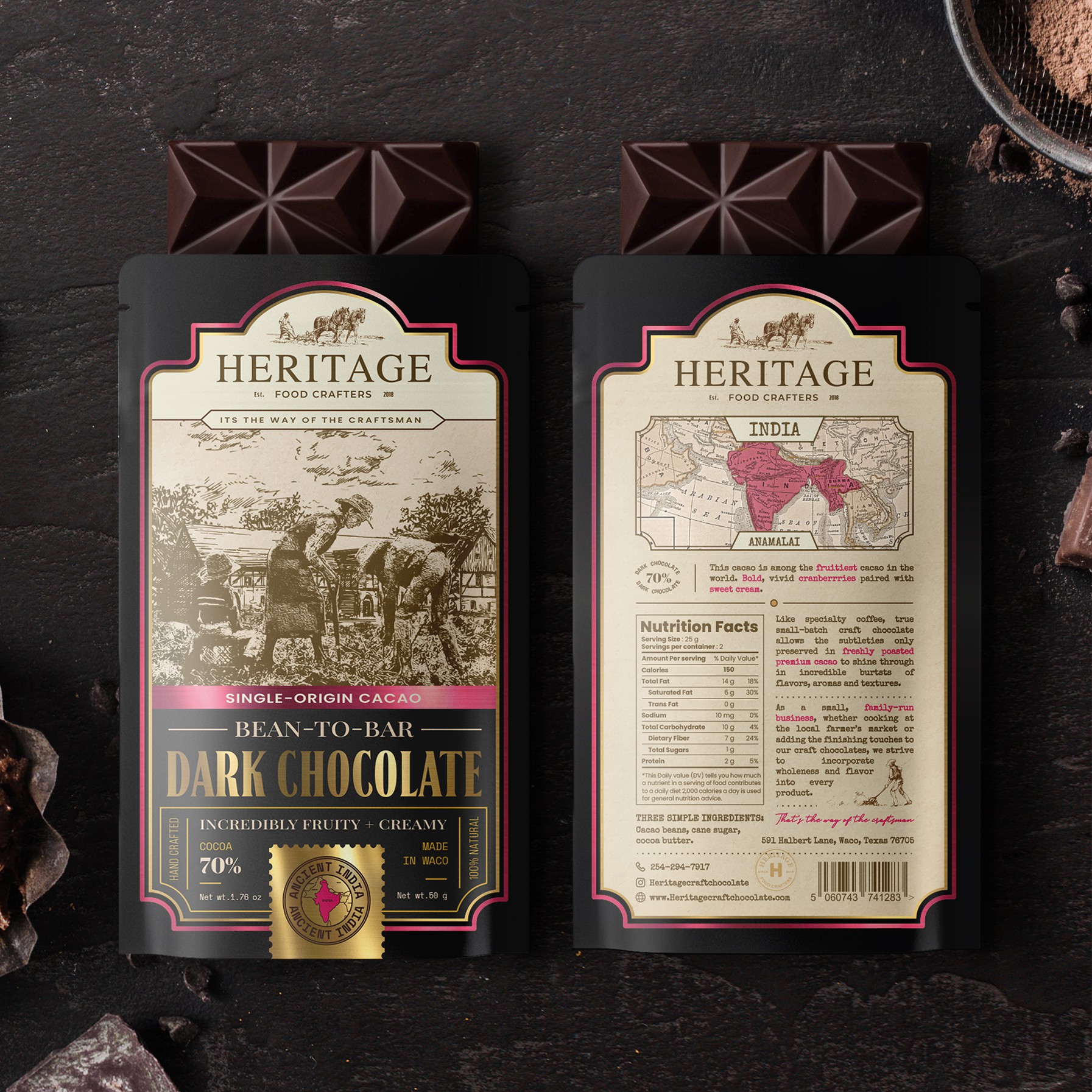

The challenge was to convey the friendly community atmosphere, craftsmanship and love with which their small batch chocolate is made. Therefore, in my design I used drawn illustrations, a rough background reminiscent of the texture of old paper, attention to detail in the placement of the text, the choice of appropriate fonts, and the use of a black background combined with brownish-beige hues and gold.
To convey unity, and heritage, I used a photograph of one of the farm families living here, stylized as a painted illustration that shows how knowledge is passed down from generation to generation. In the background, I placed illustrations of the farm and natural scenery that complement the people in the foreground and create a more whole picture of the farming community.
Since the chocolate will have several types based on different places of origin, colored pink foil and pink accents on the back were used to differentiate them from each other.