Redesign the tech company logo

26
Created on 99designs by Vista
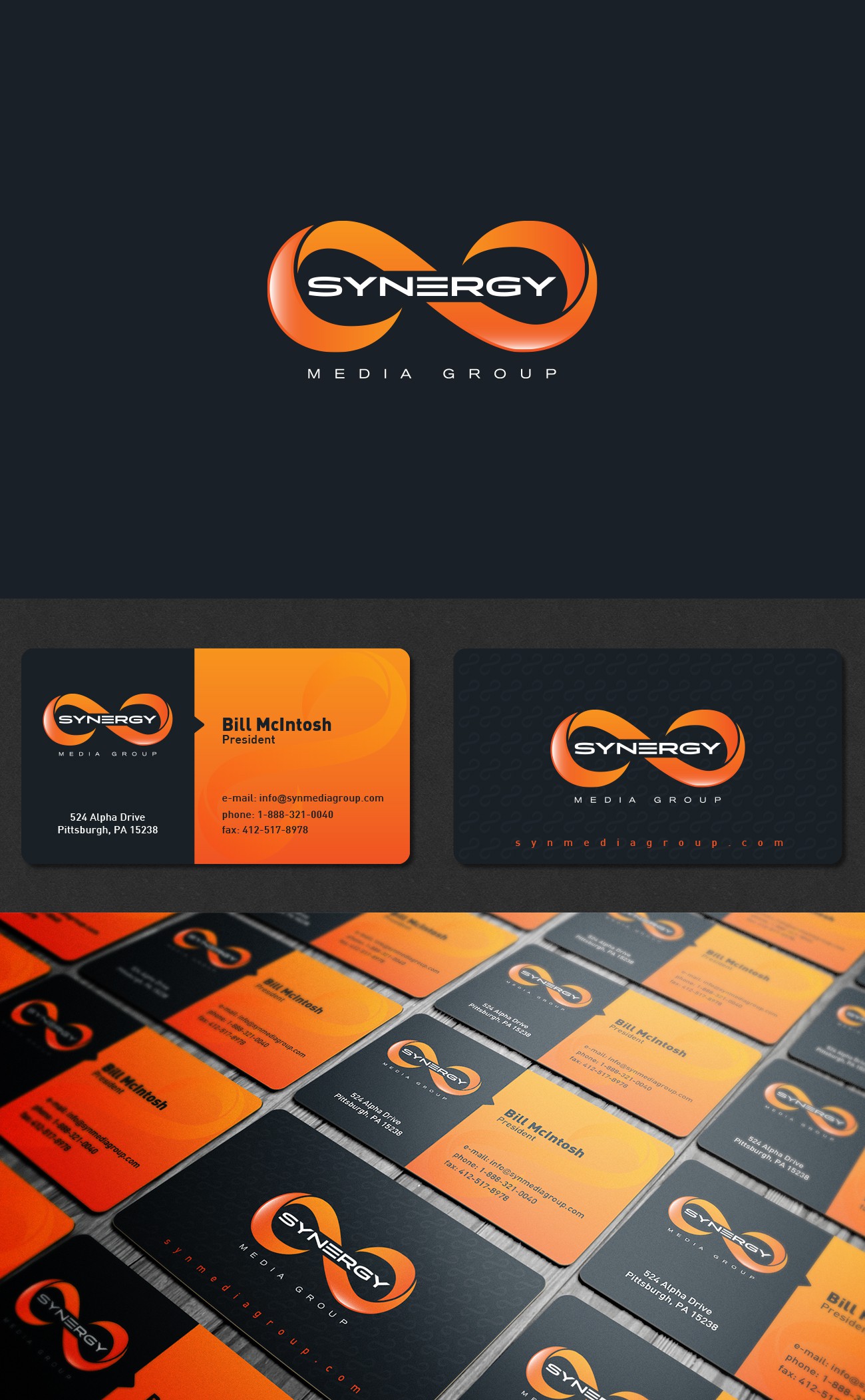
Old logo was an outdated infinity symbol with uninspiring typography so the whole logotype was a real mess... One of the mandatory requirements was to preserve and modernize the symbol in some form and update the typography as well. I like the final outcome:)