Low sodium high potasium seasalt

0
Created on 99designs by Vista
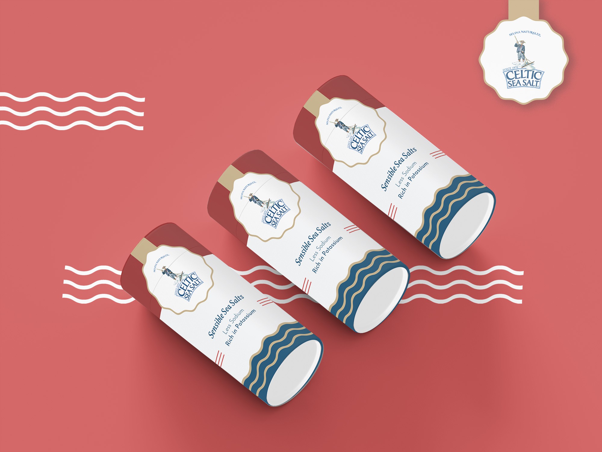
Through my design I looked for a package that could attract the ideal client 50+ years, as mentioned in the brief. But I also wanted to keep it simple, with a strong heritage idea but clean spaces and playful lines.
The typography was chosen trying to respect the style the brand has been using in the previous labels.
I think this package design is a bit modern, a bit classic and a bit minimalist.