
Created on 99designs by Vista
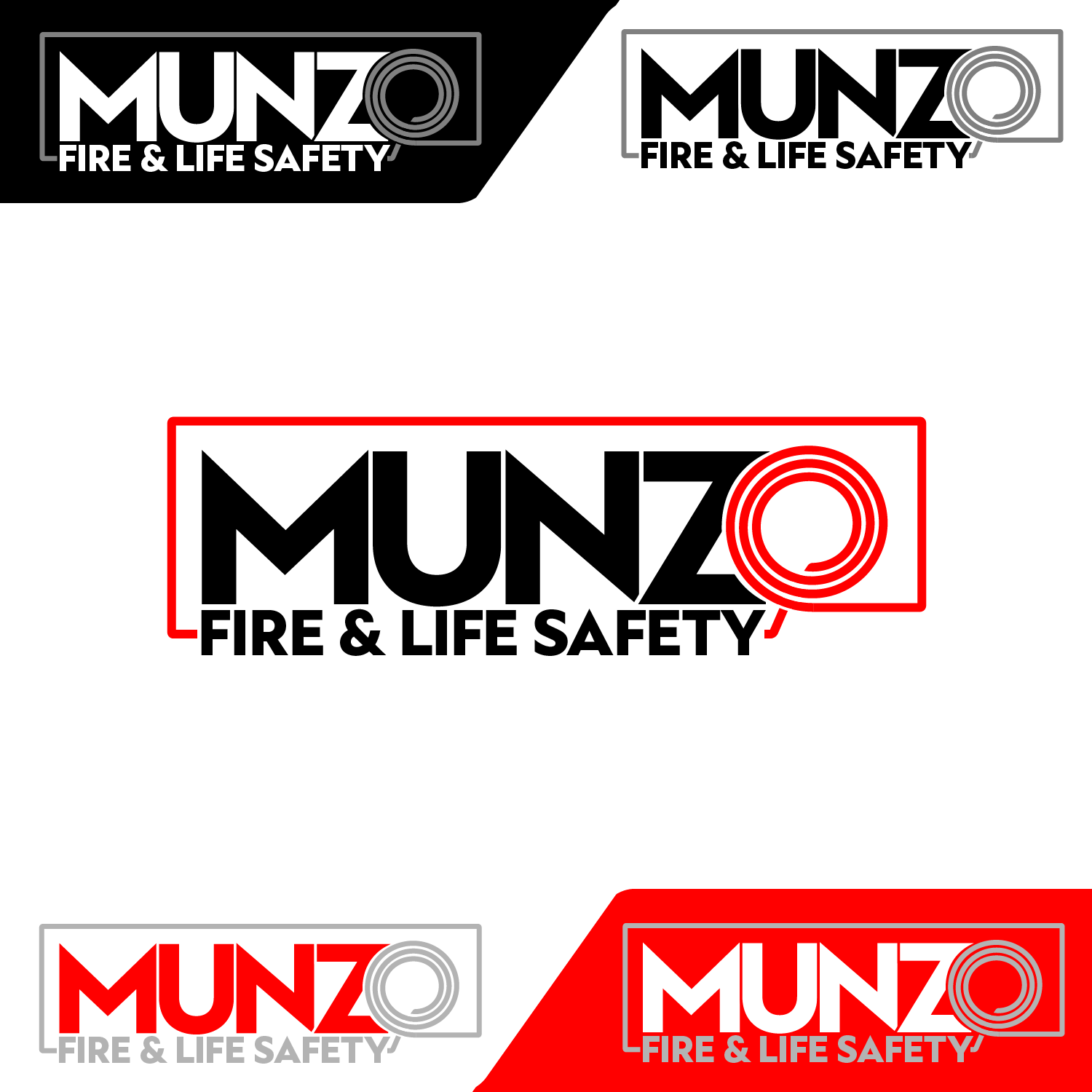
The logo is built around the idea of having a fire hose as the "O" of the company name.
The hose is then used to define a perimeter around the brand name, reminding the safe and protected space the company creates where its safety systems are installed.
This perimeter, togheter with the squared and heavy font, also gives the logo a sturdy, industrial and modern look.
The slogan is integrated in the logo, with the same font and matching colors to the name or the hose, depending on the color compination.
Five different color variations of the logo are presented in this preview.
-SemmyF