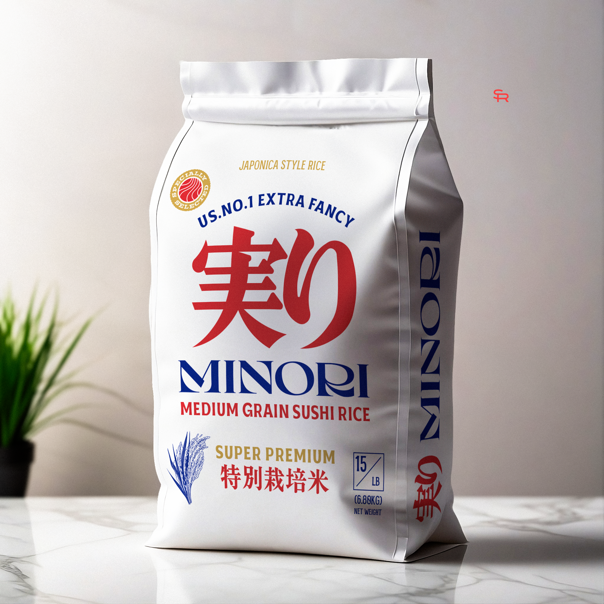

This packaging design showcases a clean and elegant approach for a premium Japanese-style sushi rice brand. The layout emphasizes tradition and quality, appealing to both authenticity and modern simplicity. The bold red kanji ("実り") creates an immediate connection to Japanese culture, while the blue serif typeface for "Minori" conveys sophistication and trustworthiness. A combination of red, blue, gold, and white evokes a balance of heritage and luxury.
The design features a clear hierarchy, ensuring key information like "US No. 1 Extra Fancy" and "Super Premium" is prominently displayed. A gold seal and an illustrated rice stalk reinforce the product's premium quality and authenticity. Practical elements, such as clear weight markings and bilingual text (English and Japanese), enhance the packaging's usability for a diverse market.
The overall design reflects the brand's dedication to delivering a superior product while resonating with culturally conscious consumers.