
Created on 99designs by Vista
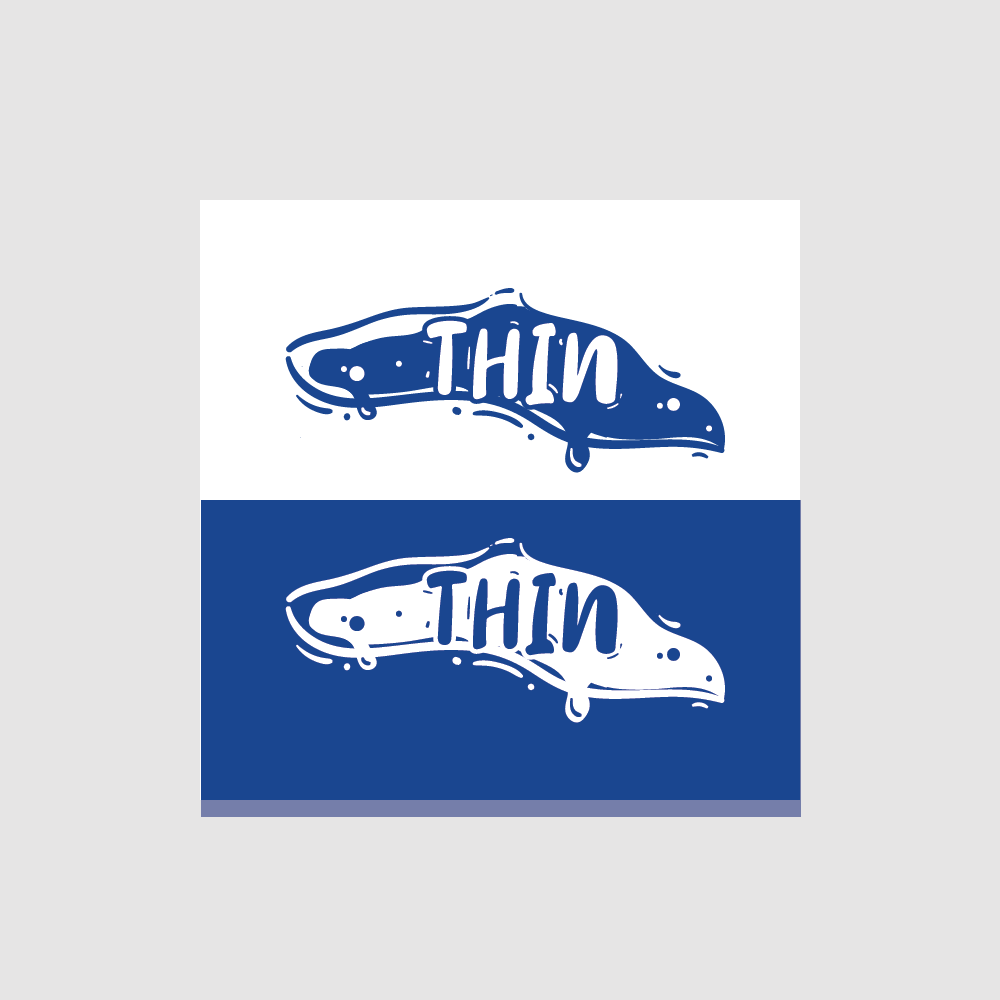
I got this logo inspired by another logo of their pizza brand 'Thick'. So it looks like there is a connection for both that can show identity and trademark for their pizza business.
As usual a thin pizza will definitely be more wavy when we hold a slice of the pizza. This can differentiate the pizza vector on my logo which is more focused on thin pizza than the regular pizza logo.
I tried to apply a thinner font than the 'Thick' logo to suit this brand name. But I am worried that the thin font size will make this logo difficult for people to read. So I just stylish the name of this logo so that it looks more fancy and attractive to give a thin impact effect from the pattern that looks a little crowded on the name of the logo.