
Created on 99designs by Vista
It is a great pleasure for me to work with the great David Copperfield after one winning competition. Three logos were made in the projects, which were created from a nice cooperation. All three logos are monogram.
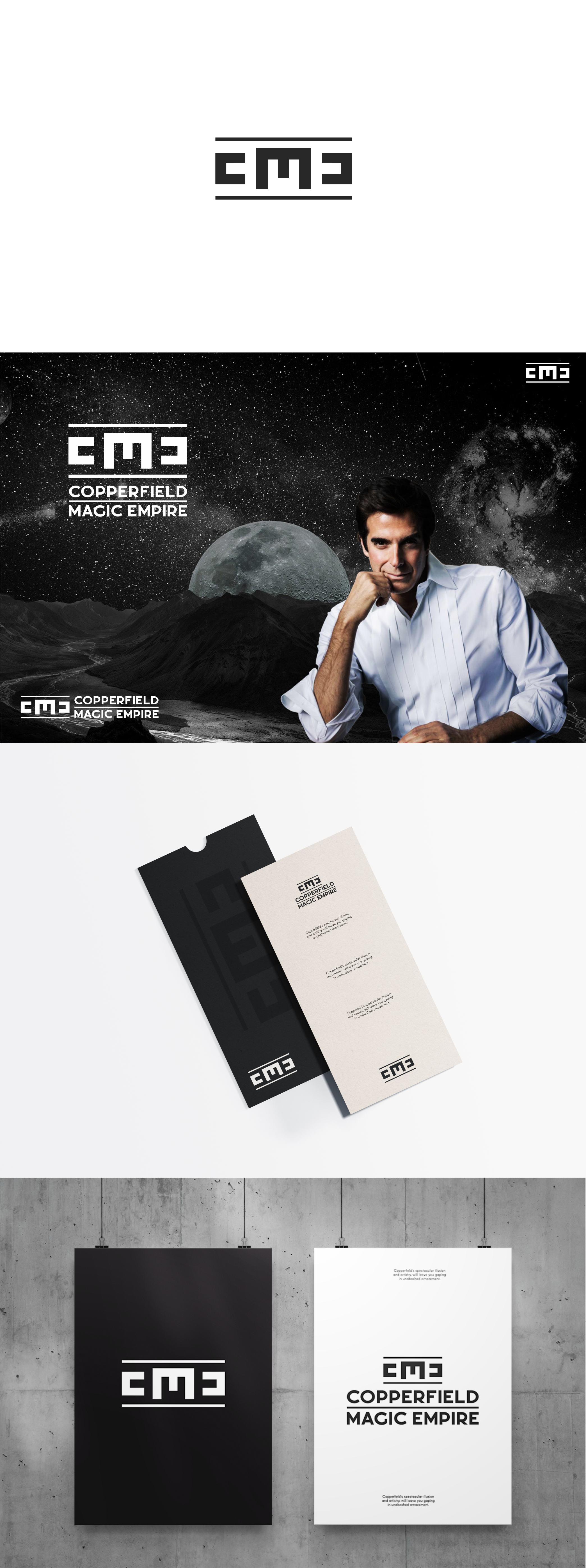
The concept of this symbol started from the letter E, which turned 90% to the letter M. The rest is magic. The letter C is drawn from the empty space of the letter E and everything is in symmetry.
As with the other logo "Reading" goes so that the observer clearly sees C, M as he crosses the gaze following the white part of the logo, but as he comes to the last element, he turns into the letter E which is in the negative and thus the logo reveals a little visual magic, visual transformation and clever use of negative space. ...