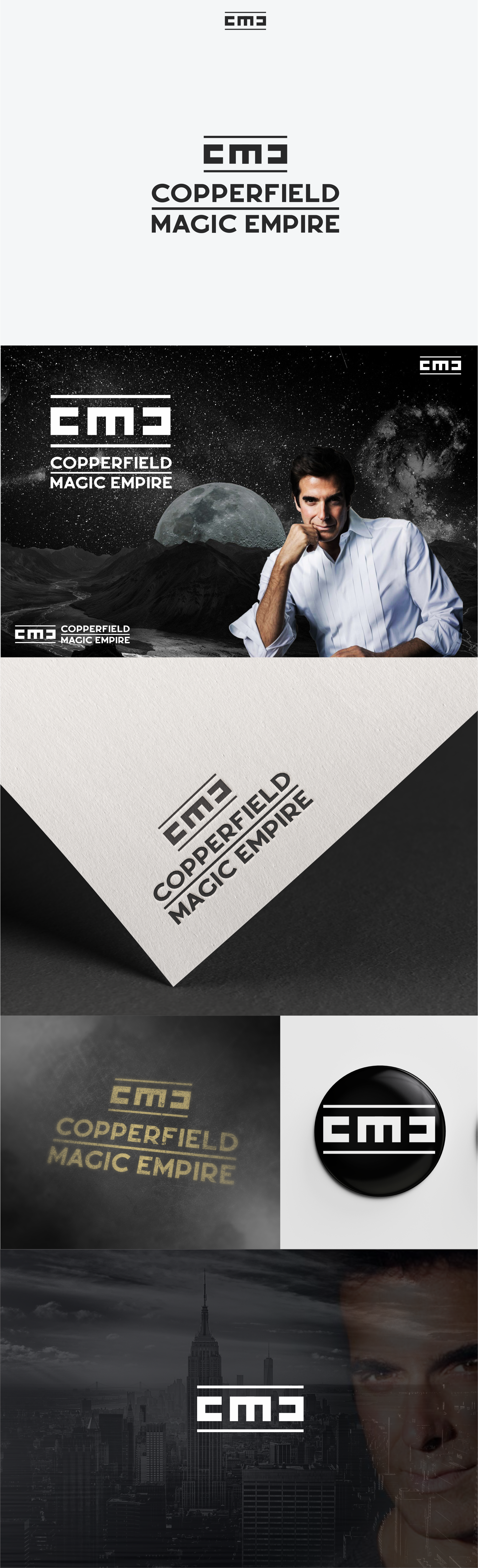

It is a great pleasure for me to work with the great David Copperfield after one winning competition. Three logos were made in the projects, which were created from a nice cooperation. All three logos are monogram. Two of the three final logos are accompanied by magic and visual transformation and clever use of negative space.
The logo communicates well with the meaning of magic, It is this iconographic story about the hidden world of magic.
This logo has visual magic and just like the other logos made it hides the Letter E which is noticed when you first cross the eye over the logo. He is hidden and connects with the magic he is supposed to present. Magic exists and builds the Empire. The logo is completely symmetrical, the golden ratio is used and all the elements are identical and from the center as if viewed in a mirror.