
Created on 99designs by Vista
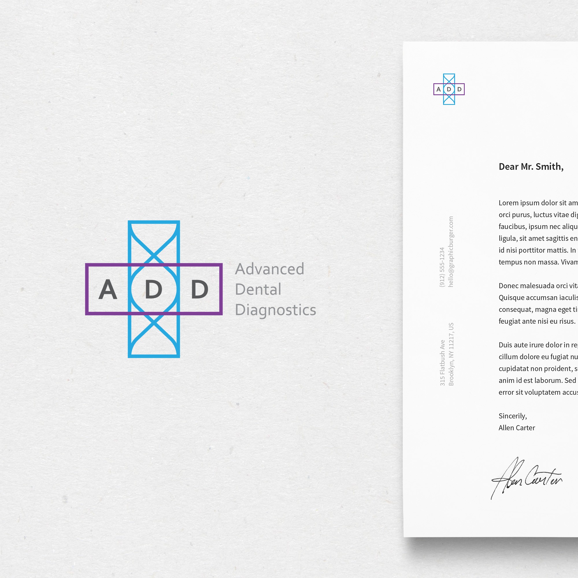
When somebody hears the word "ADD" the first thing that pops up in their mind will be the plus symbol. So i thought it will be nice to incorporate that idea to the design so that it becomes unique and will stand out. "ADD" is given in a horizontal rectangle which is dark in color so that it is easily readable. The vertical rectangle shows a DNA ribbon that is in a lighter tone. Thus the logo resembles to the addition symbol and as a double advantage it can also signify the medical cross. I am open to all suggestions and changes.