
Created on 99designs by Vista
This is my idea behind Fly Equestrian's logo concept.
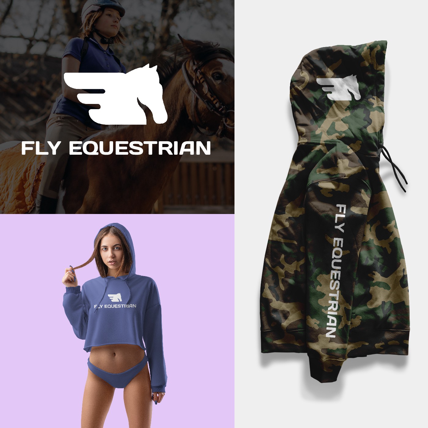
I make the logogram as a fly horse with the hidden word F in the wings in negative space, to represent Fly Equestrian. I made it to be rounded corners because its easier on the eyes than a corners with sharp edges because they take less cognitive effort to visually process.
I also choose the font that match for the logotype.
Why you should choose my design?
Because, if you wanna have some revision for this logo, I'll do it. With no limits of revision. If you want social media design, product design etc. I'm fully ready because I'm experienced as head designer and content creator in Instagram accounts with total of 50k+ followers.
Thanks & regards
Anugrah Abadi
Graphic Designer