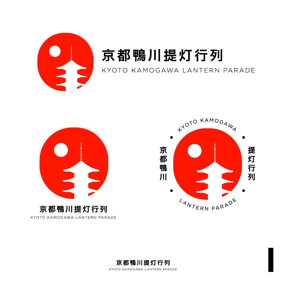

This logo resembles the night scape of Kyoto. Within the silhouette of the red lantern, stands the iconic landmark in Kyoto - the 3 storey pagoda of the Kiyomizu Dera temple, with a moon beside the building.
The logo is simple and minimal yet is designed with a modern and authentic touch. The colour of the logo is inspired by the red colour in Japan's flag, and also red is the colour of the temples in Kyoto.
The english name for the event is also included so people who doesn't speak or read Japanese would know and understand the logo and the event.
There are 3 possibilities/variants of the logo, which provides versatility of the application of the logo in different platforms and spaces.
I hope that this logo design will help brand Kyoto and this event with a new and fresh approach so the event can be recognised by people around the world.