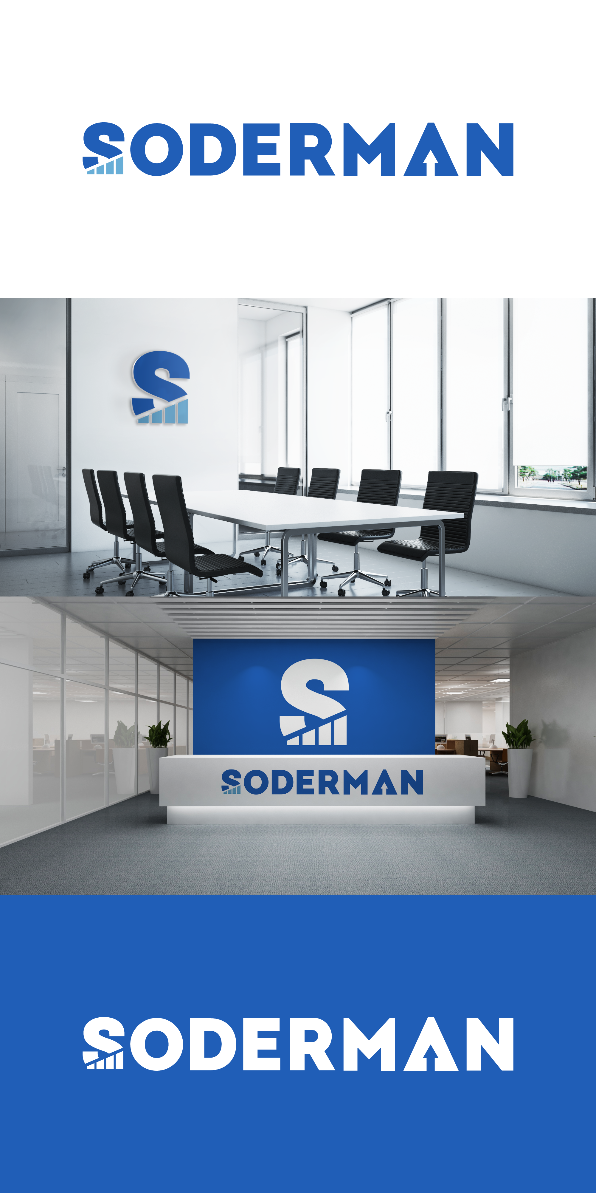
Pretty self-explanatory logo.
The client wanted the letter "s" to stand out and incorporate an arrow pointing up.