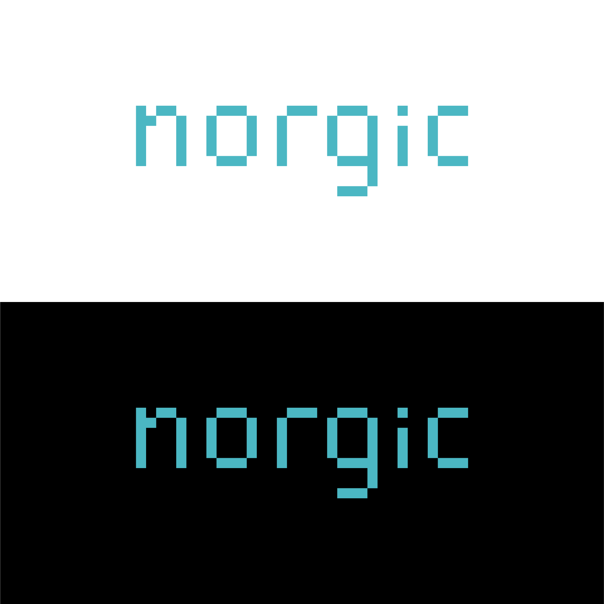
8bit logo for Norwegian IT company

0
Created on 99designs by Vista
This custom 8bit wordmark implies that this is a tech/IT company without unnecessary icons or cliché symbols.
While many programming fonts are monospaced, I had to kern the "r" and "g" closer together to make it look right.
Developers, engineers, programmers often do their work using inverted colors (easier on the eyes), so I showed both a light and a dark palette as a further nod to the industry.