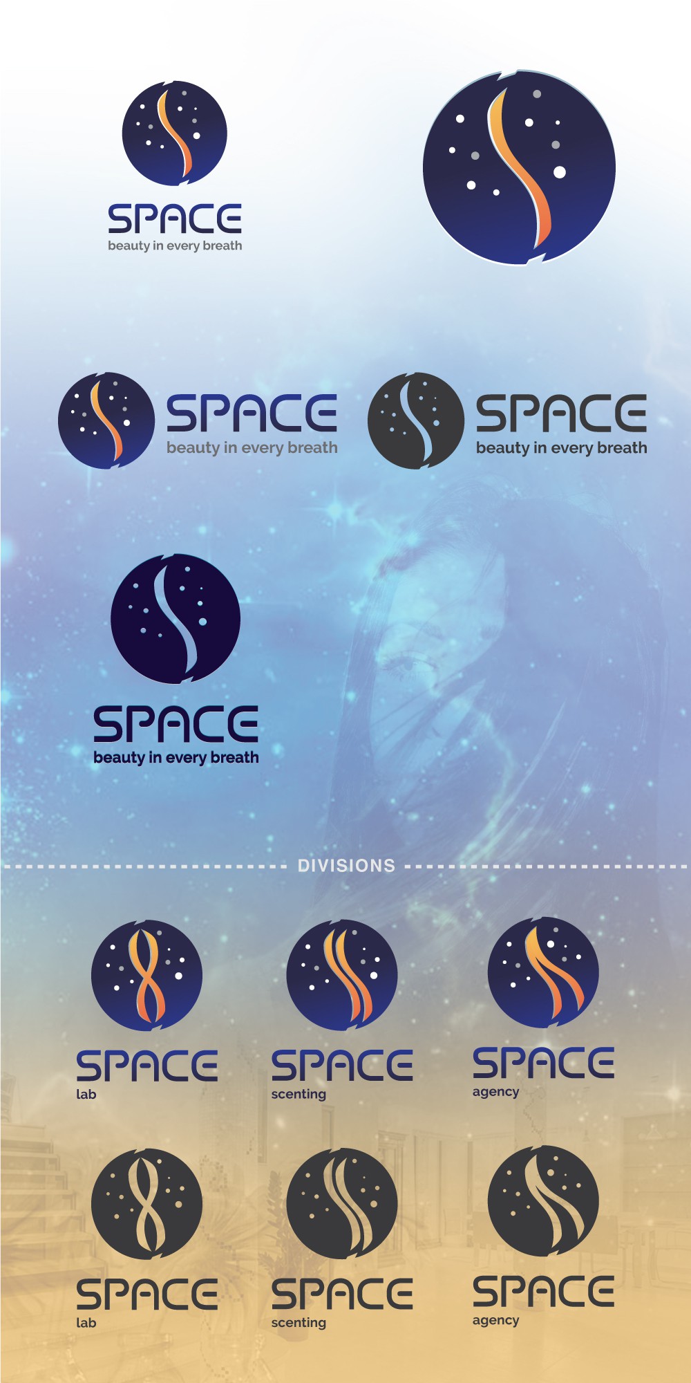

I wanted to convey a sense of awe on the discovery of new emotions which let you enjoy even more the environment around you. This mark is minimal, straighforward, memorable, easy to use and apply to any surface at any scale. The icon is an S shape enclosed in a circle with certain enclosures where the scent gets released, this S wave is floating in space and it is in a contrasting color around that space where the dots are the constelations and stars which connect directly to the scent particles of plants and fruits spreaded by the scent machine. Its overall circle shape shows union, movement and community. The divisions are displayed bellow. These take form by using the initial S wavelike shape.
A custom upper case typography was created for your brand. Clear and easy to read at any scale.
Colors are in shades of orange and blue were included because the mix of these two colors give a sense of fun and refreshingly appealing.