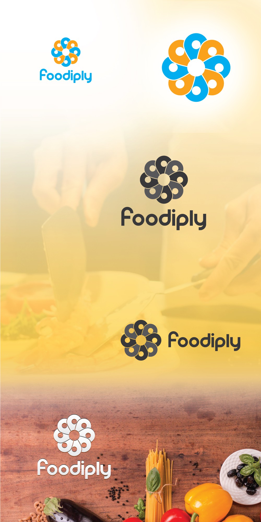

With the following mark I wanted to capture the notion of multiplicity, that this is the digital/physical hub where you can find diferent menus, flavors, and versatility for your culinary desires. Also wanted to convey a sense of fun with the shape. Its symmetrical aesthetics gives a sense of order and trustability.
Overall this mark is minimal and straighforward. It is also modern, clear, legible, scalable logo for desktop, web and mobile. It has been build to be a lifestyle brand. Shows friendliness and approachability, it is open.
Its circular shape transmits wholeness, constant movement, community and union.
Colors: Its clear blue and orange is appropiate for food services, to awake the taste buds of costumers. Also shows the different flavors costumers will find around the menu options.
Typography: An original font was built from scratch, exclusive for your company. It is clear and works at any scale, readable and its spaces measured. Plays according to its icon above.