Cover Design for thought-provoking Sci-fi Book

7
Created on 99designs by Vista
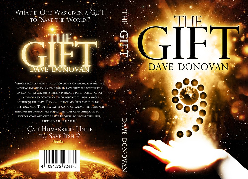
Given Dave’s thorough description, my approach was to create a scene based on the main spherical elements that made up the plot. The offering hand conveys the idea that the spheres represent the gift. The central light beam shining from behind the title created the perfect contrast. This contrast helped the cover become really eye-catching, intriguing, and mysterious at the same time. I loved every minute of the design process for the Gift. Dave is an open-minded person and a creative writer. I was extremely happy my cover design complemented his intriguing story. The Gift has got a lot of great reviews since its official launch. Both the story and the cover got amazing praise in Dave’s interviews.