Home page redesign for a marketing agency.

45
Created on 99designs by Vista
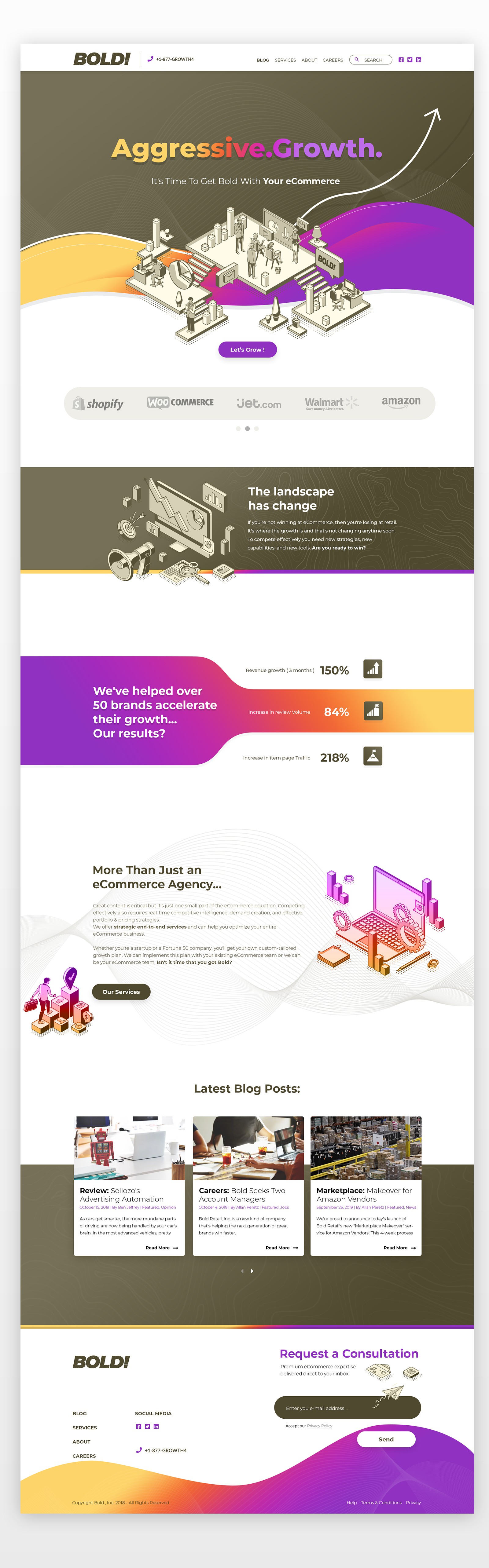
The client wanted to reinvigorate the old design and was searching to make the brown colors of the brand "shyne" somehow.
My solution was to use complementary colors next to the main brand color, i tried to make use of the white space so the colors are not to overbearing and used some isometric illustrations which reflect the business, to wrap it up all nicely.