Created on 99designs by Vista
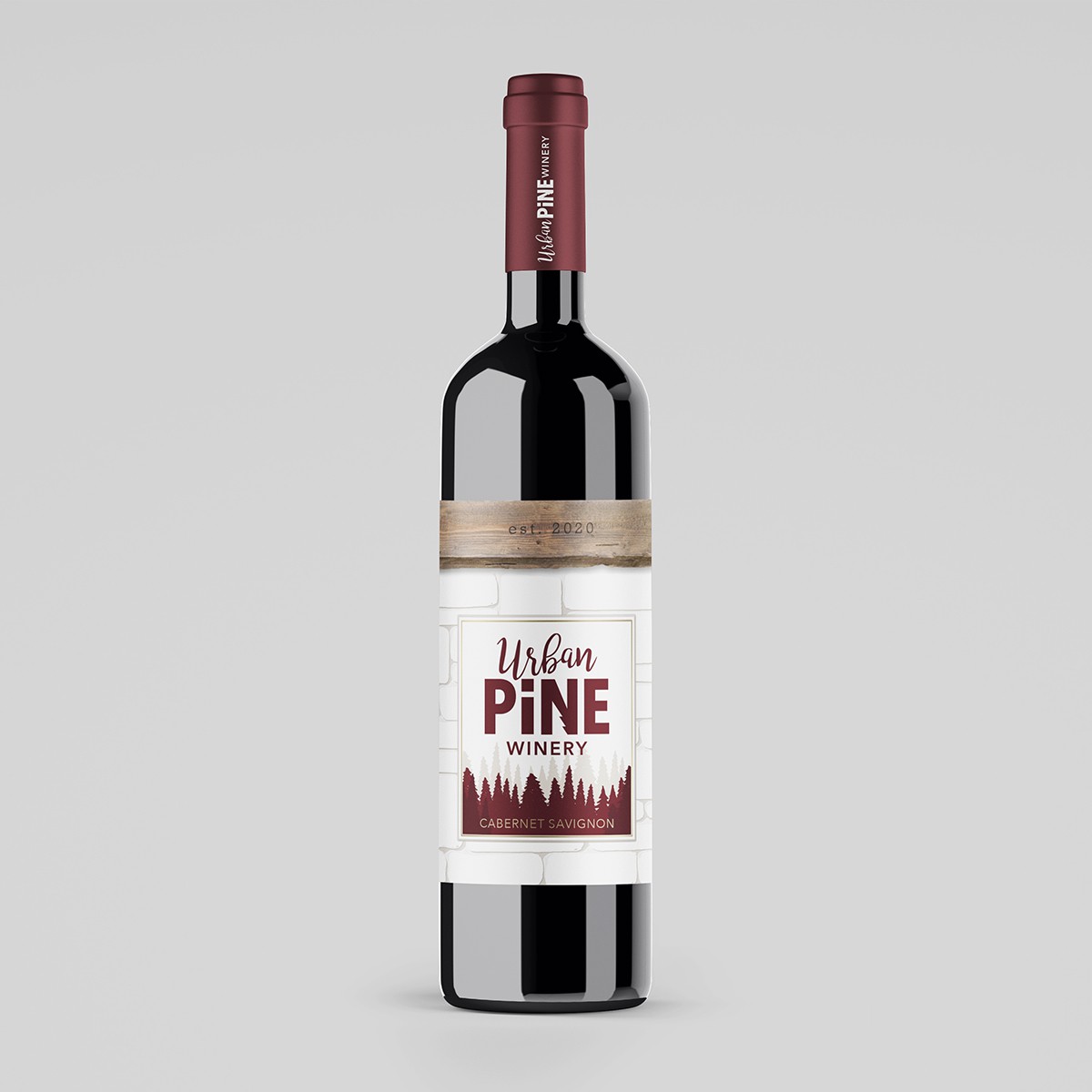
The client included the architectural plans for their new location and it featured many different materials. I used the stacked stone and the wooden beams as the backdrop for the label with the stones embossed creating a frame for the rest of the label design. The wood beam at the top is made to look like the year is etched into it. The silhouette of the pine trees would change based on the variety of the wine. Small gold accents add a touch of sophistication.
