Logo Concept for CTRL P Printing

0
Created on 99designs by Vista
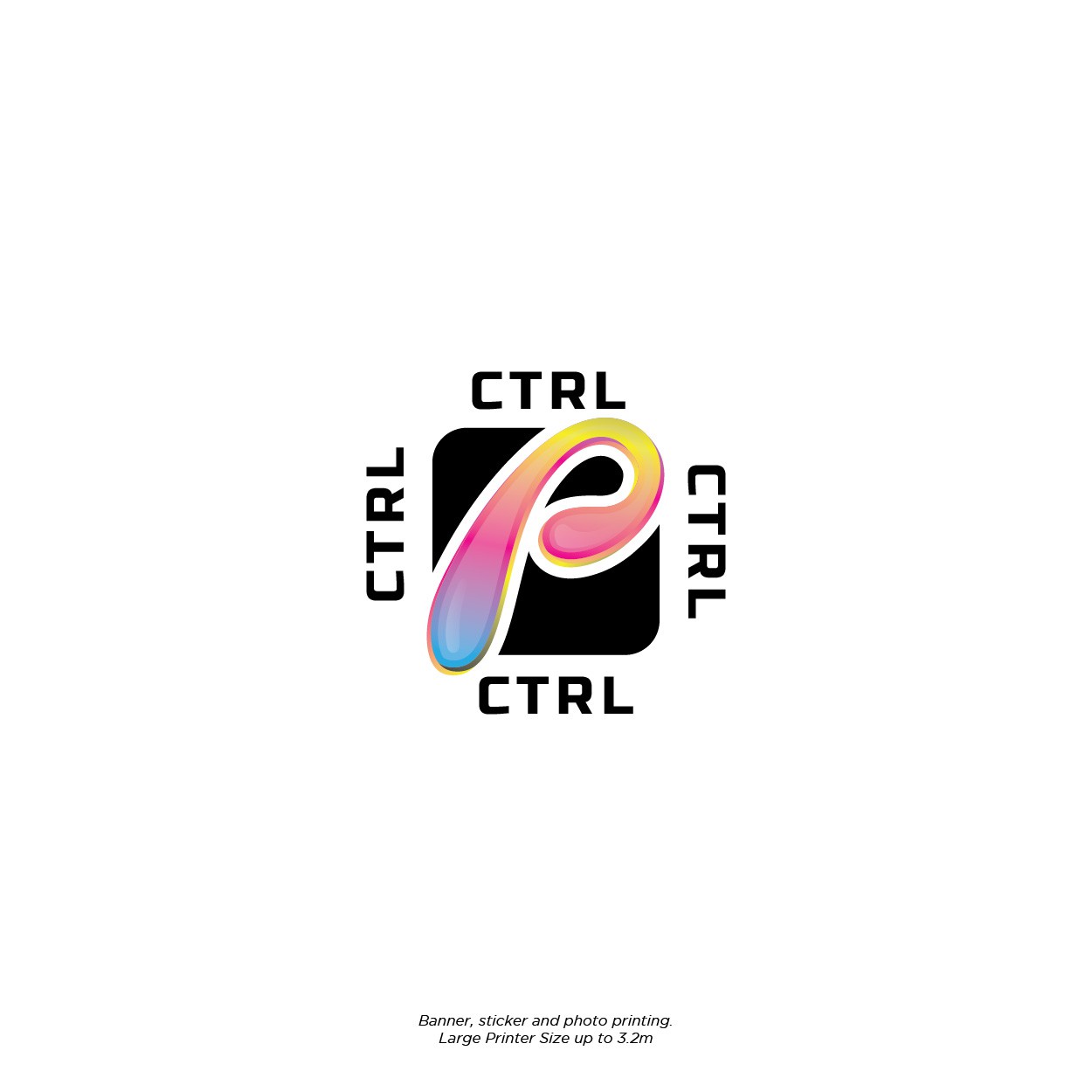
The main idea of the logo is to emphasize the P itself by mixing cmyk colours and adding some of the details sort of thing, and that 'ctrl' repeating or rotating up to 4 times symbolize that this printing company could do more than 1 work at a time, and also produce consistent results.