AllStar logo for an "Innovative" Company...

1
Created on 99designs by Vista
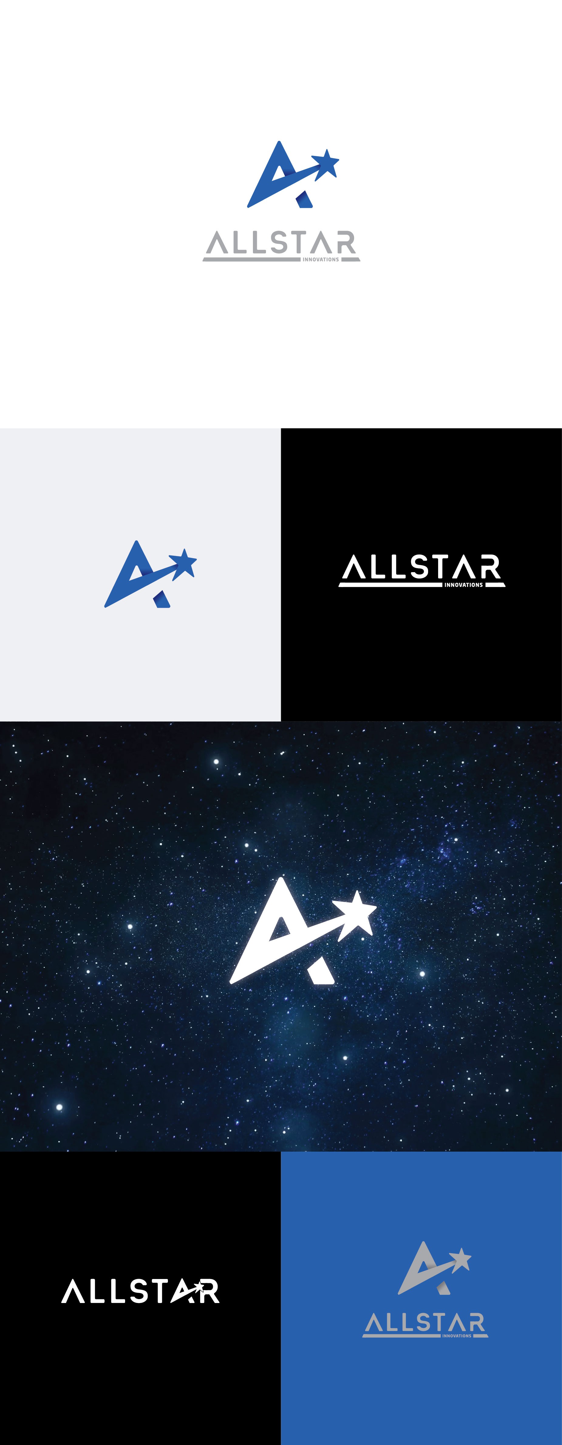
This is a concept for the rebranding of an Innovative Company Contest:
I felt that what they needed the most is an icon that can fit in every product they make and can be both recognized and also that can spark the imaginative side of their customers. That's way I chose to use the negative space to show the star that goes through the A in the name, in an upside direction to evoque growth and innovation. This icon with the slogan can work together and go in and out from the full logo.
The palette comes from ther site itself. I think that we can use that to make a new image but still to keep their costumers in tune with who they are and the confidence earned in them