
Created on 99designs by Vista
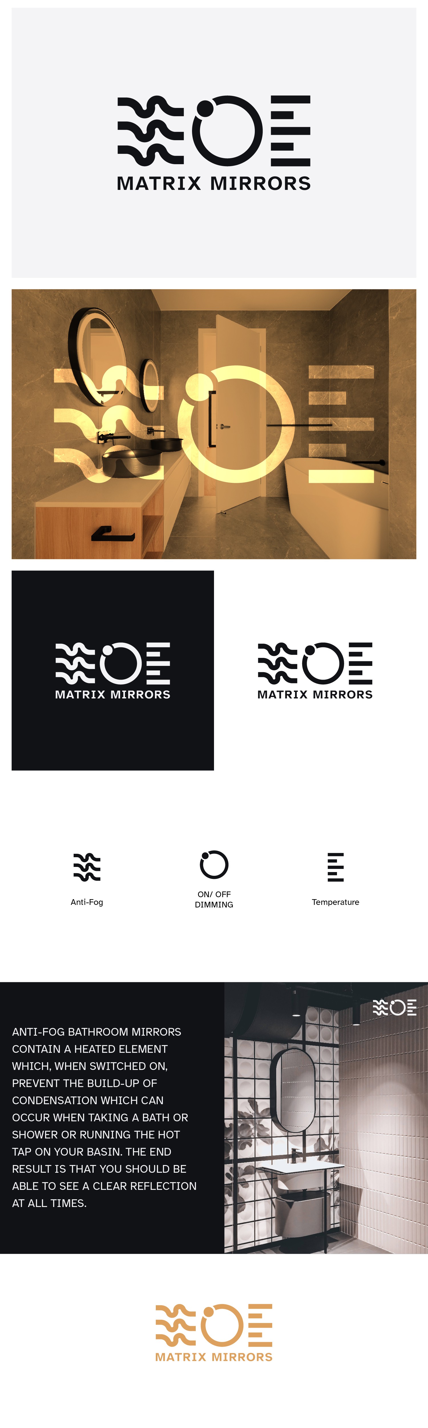
The design approach was to create 3 icons for the touch sensors that also play into the logo which was already mentioned in the brief. Moving forward to that concept I created 3 clean and simple icons from the anti-fog, On/ Off dimming & color temperature. Using the wave lines as anti-Fog (chemicals that prevent the condensation of water in the form of small droplets on a surface that resembles fog), a switch regulator icon as an On/ Off dimming & the lines are the representation of temperature.