Created on 99designs by Vista
With this design it was taken into account every guideline given by the client.
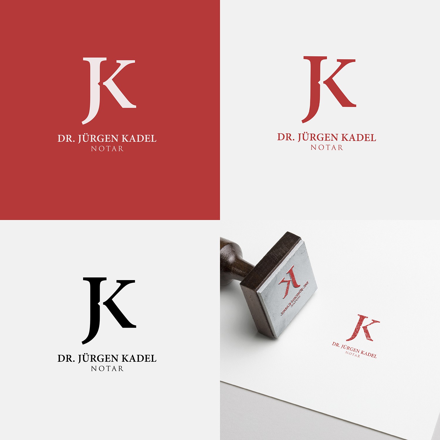
Even though the logo was designed with both the name and symbol, it should work, if necessary, separately.
Given that the image of this design is supposed to be one of tradition, balance and seriousness that the profession of the client requires it was chosen a serif font.
Being that the client´s business name is its own, Dr. Jürgen Kadel, the main guideline of the concept was that it should be a fusion between the initials of the Dr´s name. This technical choice is generally known as being both elegant and serious, thus keeping a timeless modern look.
