
Created on 99designs by Vista
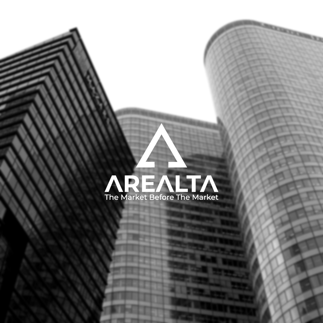
The idea behind my design is that the 'A' mark also has the negative space of an upwards arrows which shows positivity and an increase in value which is what happens to houses in real estate so it is very appropriate. Secondly, the type for the word "AREALTA" has 3 A's which I have made to also look like upwards arrows thus reinstating the feeling of an increase in value.
I hope you like and enjoy this logo.
I will also be doing a full 'GraphicCorner' Instagram presentation over on my Instagram ( http://www.instagram.com/graphiccorner ) so I hope you also enjoy that if you decide to check it out.