
Created on 99designs by Vista
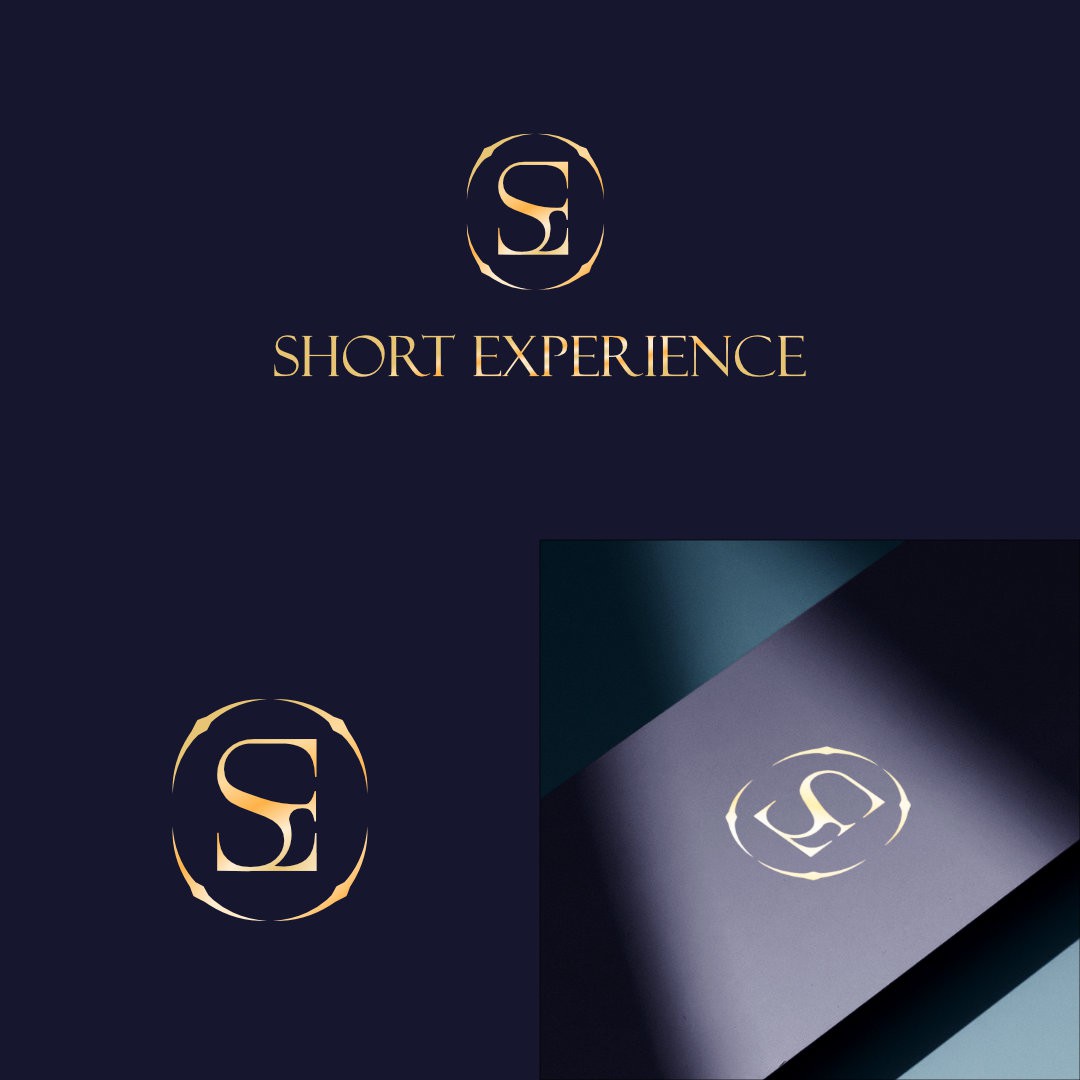
This time, the concept is more focused on luxury. By combining the initials S + E in such a way that they make a design with a luxurious feeling, plus the curves made from this combination, a map image representing the destinations is created. while the circle that frames it represents harmony.
I purposefully did not include cruise features or other modes of transportation because I believe we must convey brand value to clients through visuals rather than the products or services we offer.
I hope you enjoy it! Thanks.