
Created on 99designs by Vista
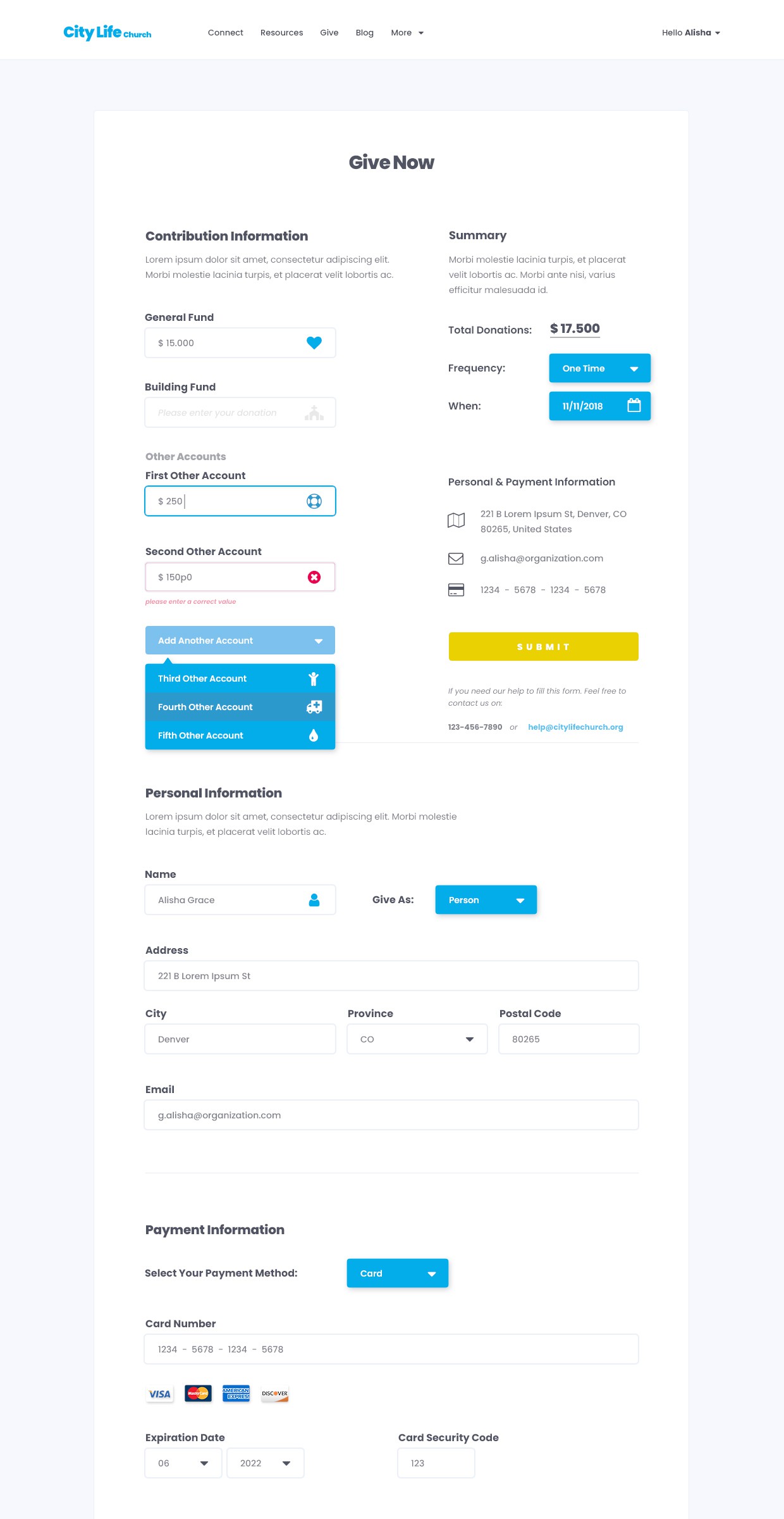
City Life Church wants to redesign the current design of its online giving form.
My approach was to redesign the form, make it simple and visually appealing, while still preserves the usability and intuitive experience on any medium, whether it's on a desktop, tablet or mobile.
The blue border will help the user focus on the active field. The blue icon on the right side of a field indicate that the field has been filled correctly. The error message along with the red border will help the user find and fix the error.