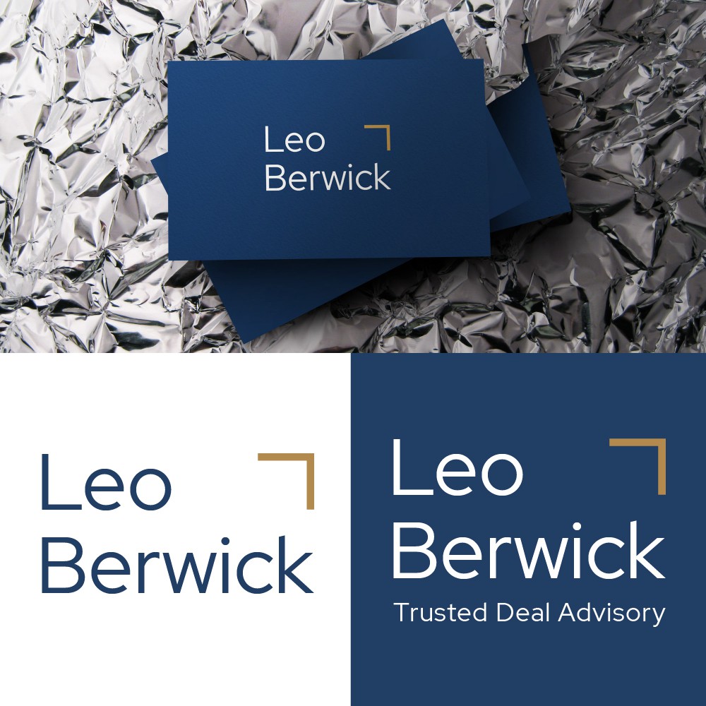
Leo Berwick are a financial and tax advisory firm focused on mergers and acquisitions. CH want to keep the logo very simple. Concept : the icon is an arrow , up right direction of the arrow as growth symbol.