
Created on 99designs by Vista
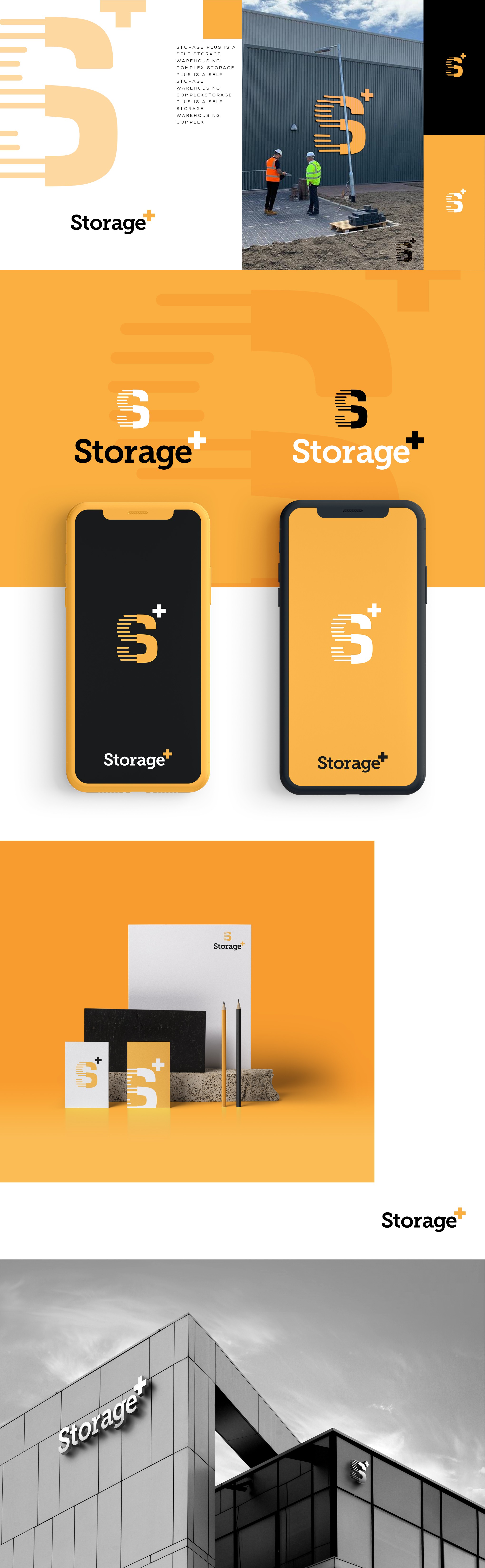
Originally Storage Plus simplified down to Storage+. This was done to make the mark more pleasing to the eye but remain readable.
A minimal icon featuring a layered design to show storage on one side with a solid half to symbolise the warehouse it lies within.
Various mockups to help client see potential usage.