
Created on 99designs by Vista
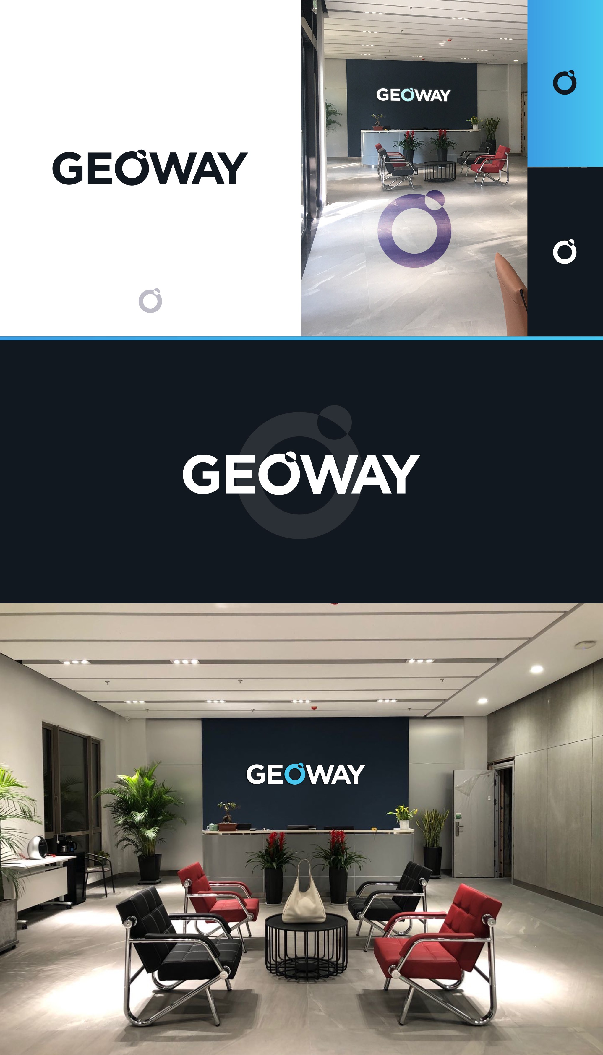
Client wanted a wordmark logo that maintained representation for the company.
My design plays on the "GEO" aspect focusing on the O playing its part as a earth like shape with a smaller circle orbiting to emulate a satellite or "moon"
Extremely simple and meant to be as minimal as possible to not distract from the wordmark as a whole.