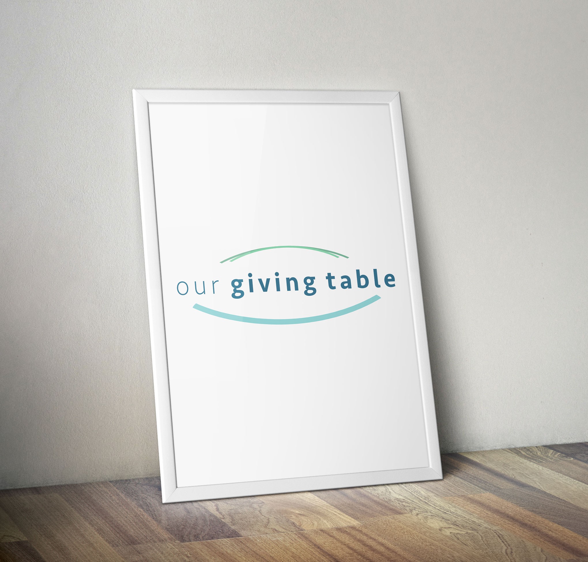

My design process began with selecting a color palette that would highlight the mission of Our Giving Table. The color green represents growth and new life, which speaks directly into the purpose of Our Giving Table—giving nourishment, opportunity, and growth for children in Foster Care and less privileged homes. Blue is the color of peace; and the work that Our Giving Table does provides peace for children in the Pacific Northwest.
The imagery of the logo is a youthful and abstract depiction of a table. It also has the appearance of a platter—which is significant since providing nutrition is the focus of the organization. Because the organization itself is the true gift to the children it serves, the table/platter holds, in the middle, the words “Our Giving Table." The green and teal strokes do not meet in the middle to signify that Our Giving Table is open to and welcomes all children in need.