
Created on 99designs by Vista
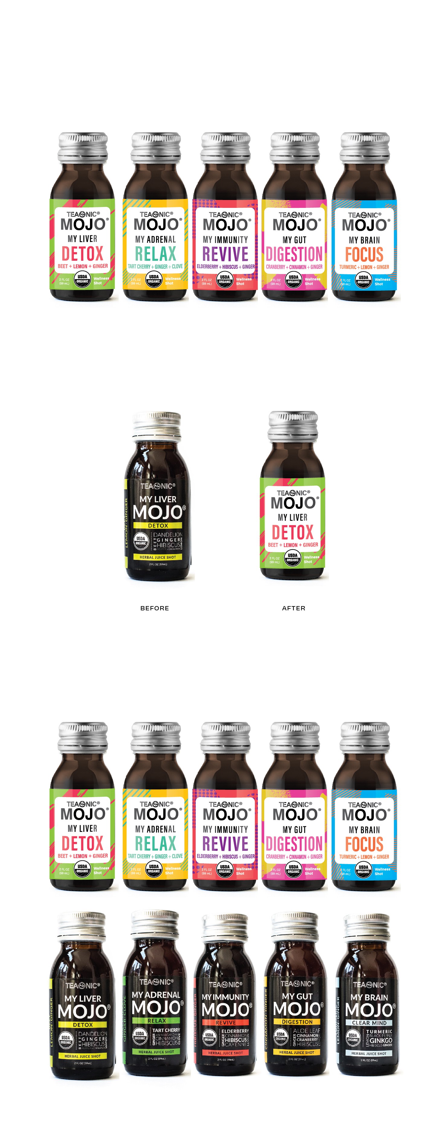
The task was to create more impact on shelf by means of the use of color and patterns. Also had to convey the effect on the body in a more evident way.
The result is a loud label that tells the functionality while the color scheme provides energetic vitality.