
Created on 99designs by Vista
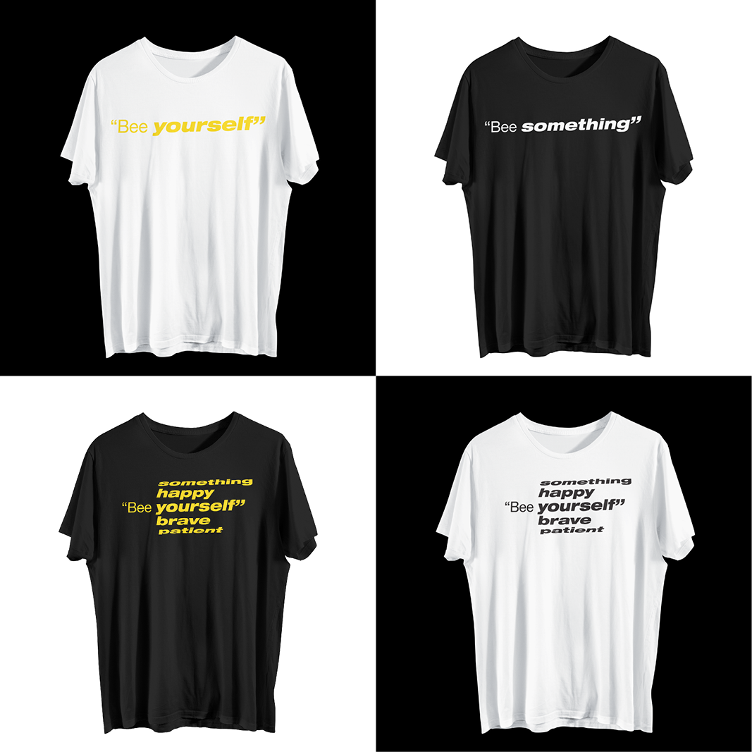
There are two different versions the first is a big, strong, interchangeable and bold design that's evidence the importance of the words, of (bee)ing yourself, patient, happy, something and brave.
The second one put the words in a "cylinder" to create a rotation to mean that we need to be all that.
The design is modern linear and minimal to reflect the new generation. The colors remind to a bee.