
Created on 99designs by Vista
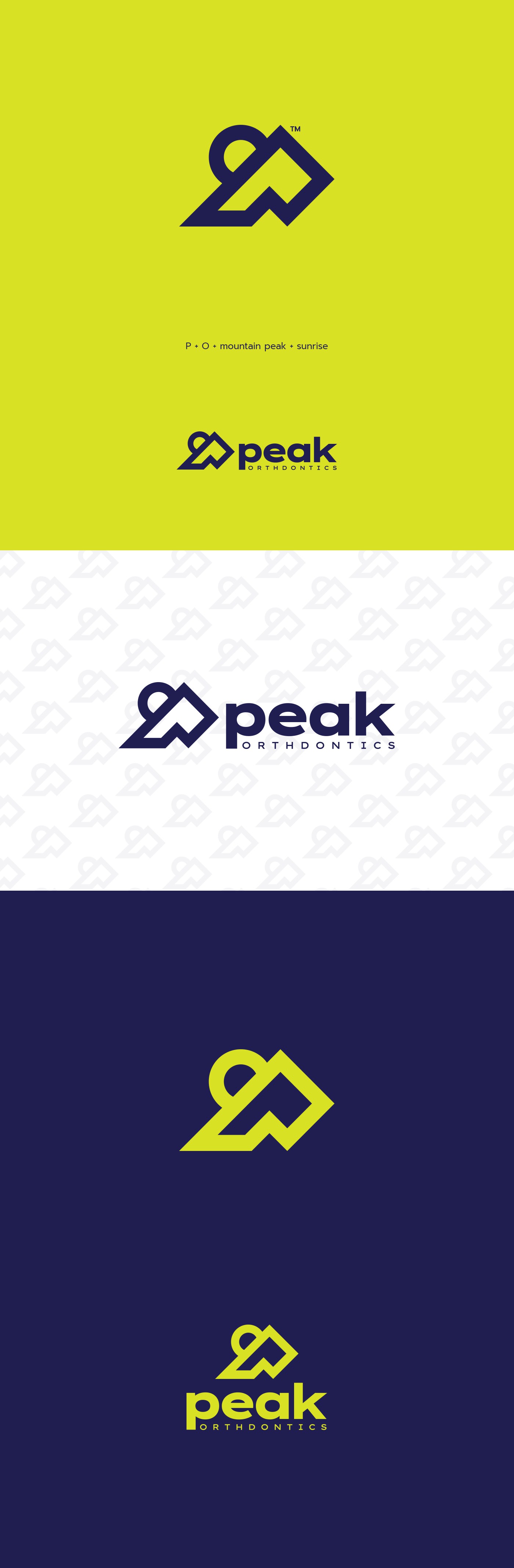
Less is more. The client wanted to find its “icon,” his “swoosh,” so that as his brand spreads across the country, everyone will know and feel who we are just by our logo.
The idea was to create a simple and minimalistic sign containing the letters P and O in the image of a mountain peak and the sunrise.