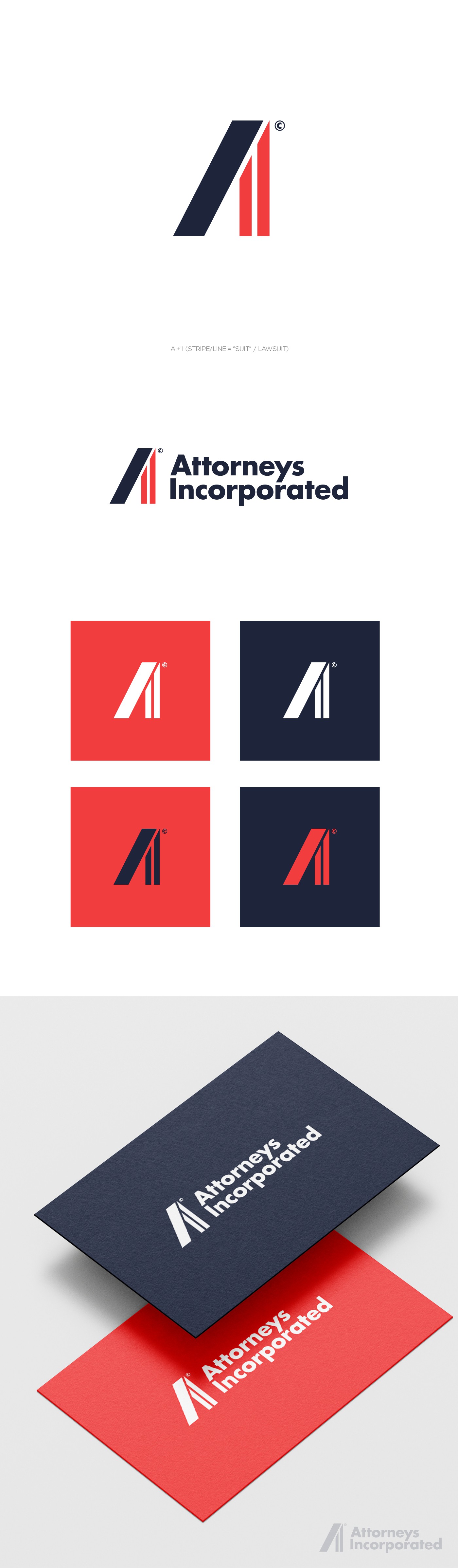
The client asked for the bold and clean logo. The font should be easy to read, even if printed in the tiniest size. The idea was to play with the initials I + A.