Logo concept for photography studio

0
Created on 99designs by Vista
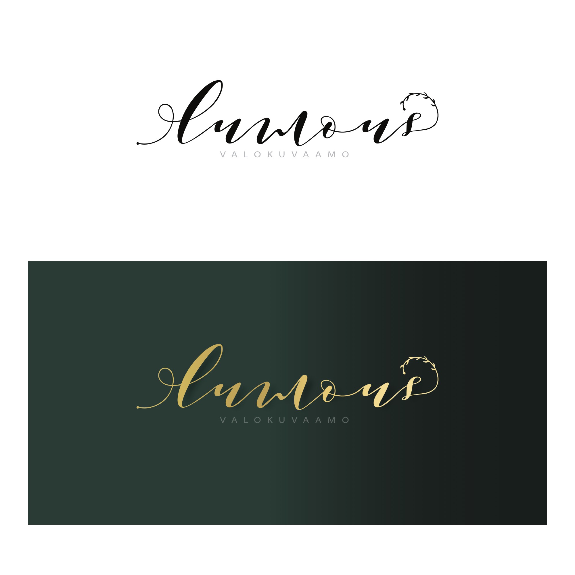
Enchanting logo design for a photography business. Emphasis on the word 'lumous' with a much smaller 'valokuvaamo' The client wanted an enchanting logo with teals and golds. In contrast to my other design (too clean and tidy) I went for a more handwriting style in contrast to the other typeface underneath. By incorporating both typefaces, it still gives the design a level of professionalism with an elegant twist. Though I have not explored creating logos before on a professional level, I feel as though I have improved in regards to meeting a brief.