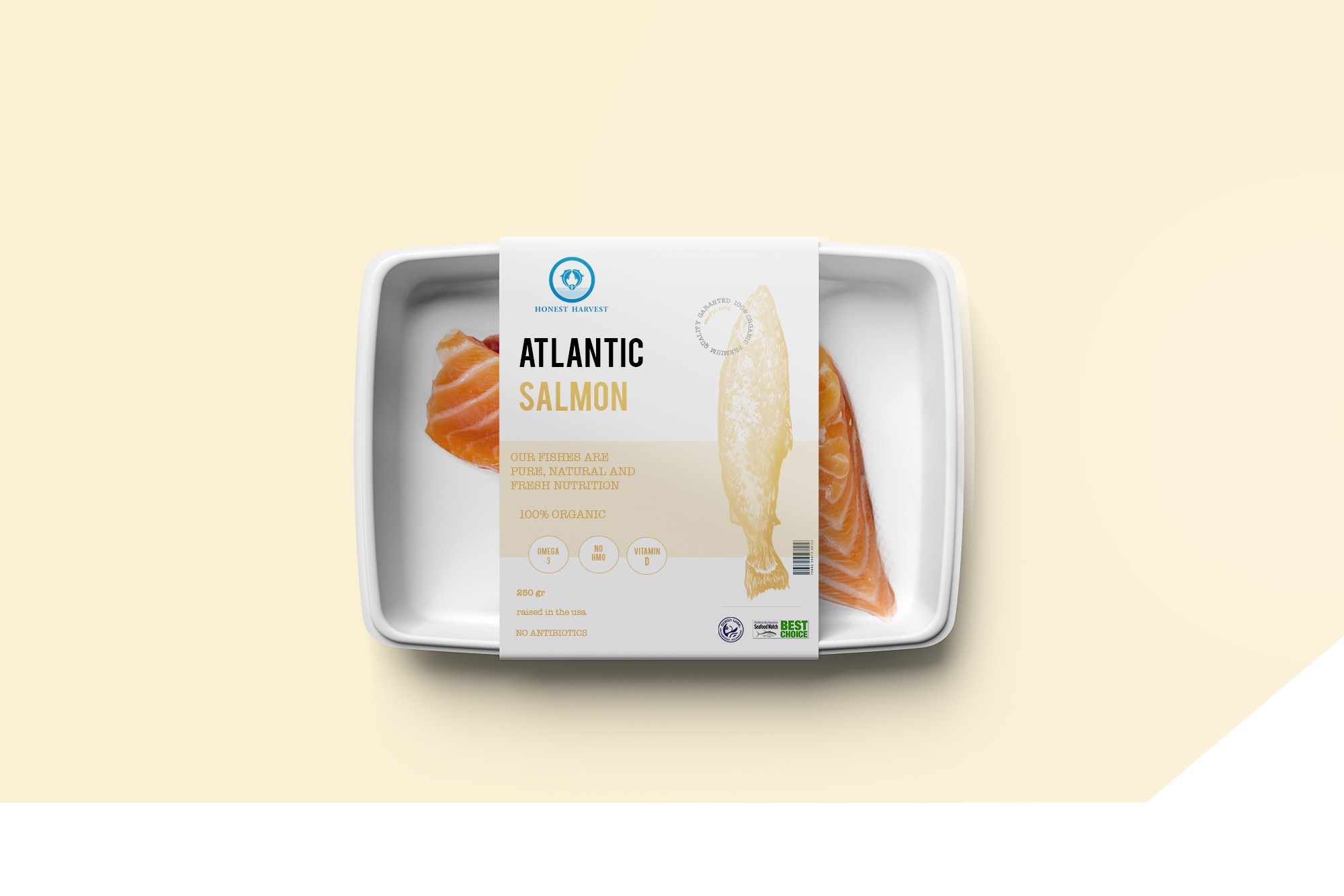

This is my design idea for a fresh food packaging.
First of all I'm a salmon lover, so I tried to design something that could have an impact for someone who loves this type of fish.
All the design tried to reclaim something clean, transparent and trust about the company. The design had to explain in some ways the values of the company, and I really think that this is the right way to do it. I applied a salmon illustration made by an illustrator only for this work (I don't pick illustration from internet), and I choosen this type of design because is comunicative by his impact style. When the customers watch this packaging, they are attract by the semplicity which they can have all the information in less words possible. I'm the first one that search semplicity when I buy food or something else. How we all know... Less is better. So this is it.
It's easy to read, easy to understand and most important... easy to cook!