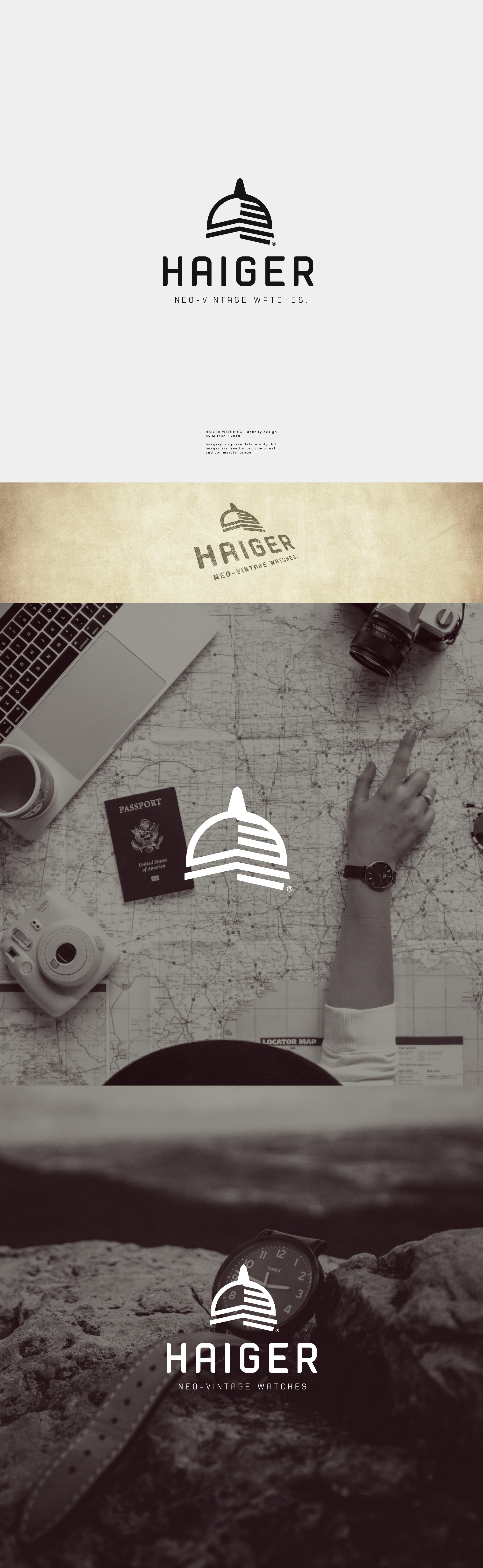

Haiger is a sophisticated vintage wristwatch brand with a lot of history behind. They were looking for simplistic logos that would go along with Rolex, Omega, Tudor and simliar brands.
They also gave words like "compass", "time ball", "rose" and "flower" for visual inspirations. In this design, i've got the object Timeball as reference, which you can see in my design the top of its tower. With a bit of different visual, i suggested it so it would stand out when compared to its competitors.
The lines i used to resemble shadows were intentionaly thick and far apart so it would look clean for printing on watches as well while blending in the logo silhouette.
As usual, I took extra the care when making it as simple as possible to not overload the overall aspect of its visual, so one could easily remember it.