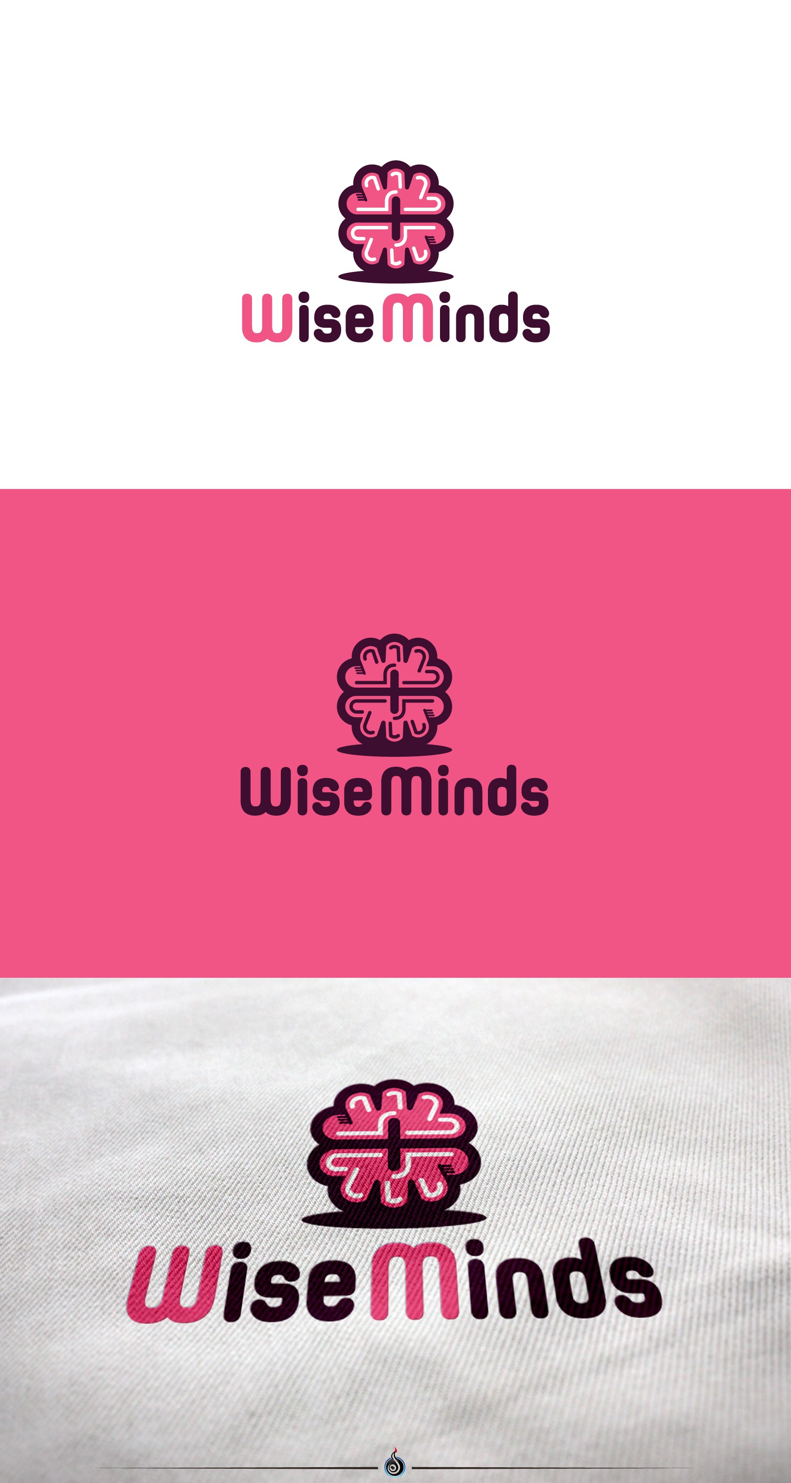
Wise minds eating disorder company ambigram logo initials

17
Created on 99designs by Vista
Logo proposal for eating disorder recovery consultant.
The symbol itself is picturing a brain that is consisting of two identical symmetrical parts.
Each part is a letter. Upper is W and lower is M letter. It`s maybe not so obvious in the first place but it`s rather abstract and for those who are more willing to see it (as there is those who are more willing to eat healthy, recover from eating disorders and take a step forward for the benefit of their health).
There is a negative space inside the center of the brain which is defining W and M letter cuts and that is presenting the + symbol as well.
It`s both for the red-cross (health symbol) and positive way of thinking and striving forward to reach positive goals.