Simple and unique logo redesign to add to already nice Swiss tech and print company logo
 by Daredjo
4
Created on 99designs by Vista
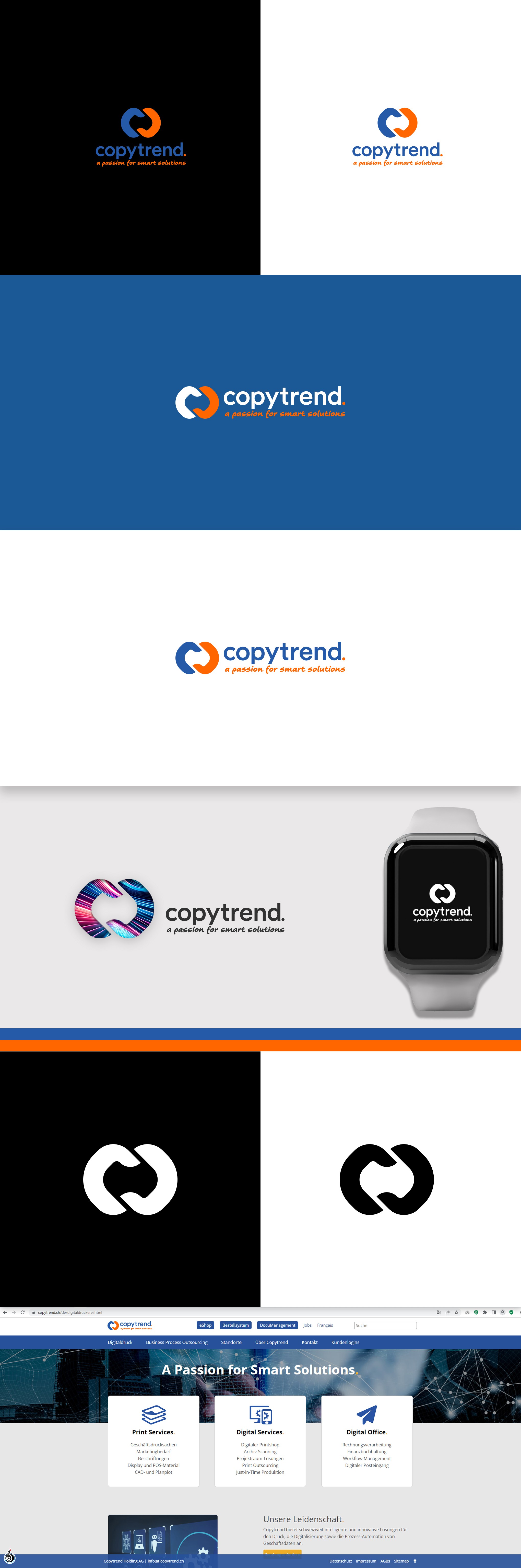
A client wanted to refresh the current logo which consisted of typography and tagline.
The goal was to add a unique symbol to the already great typography and to redesign the tagline slogan by adding a simple and handwritten-like font to it to appear more emotional.
I`m glad to say we did just that. The tagline has such appearance, and the symbol added is consisting of C that copies itself as in the mirror to form the symbol that is looking like an infinity symbol.
The symbol is meaning C letter, copying infinitely to describe the client's company, its growth on the market, and endless possibilities for the company when it comes both to developing apps, programming, and printing.