
Created on 99designs by Vista
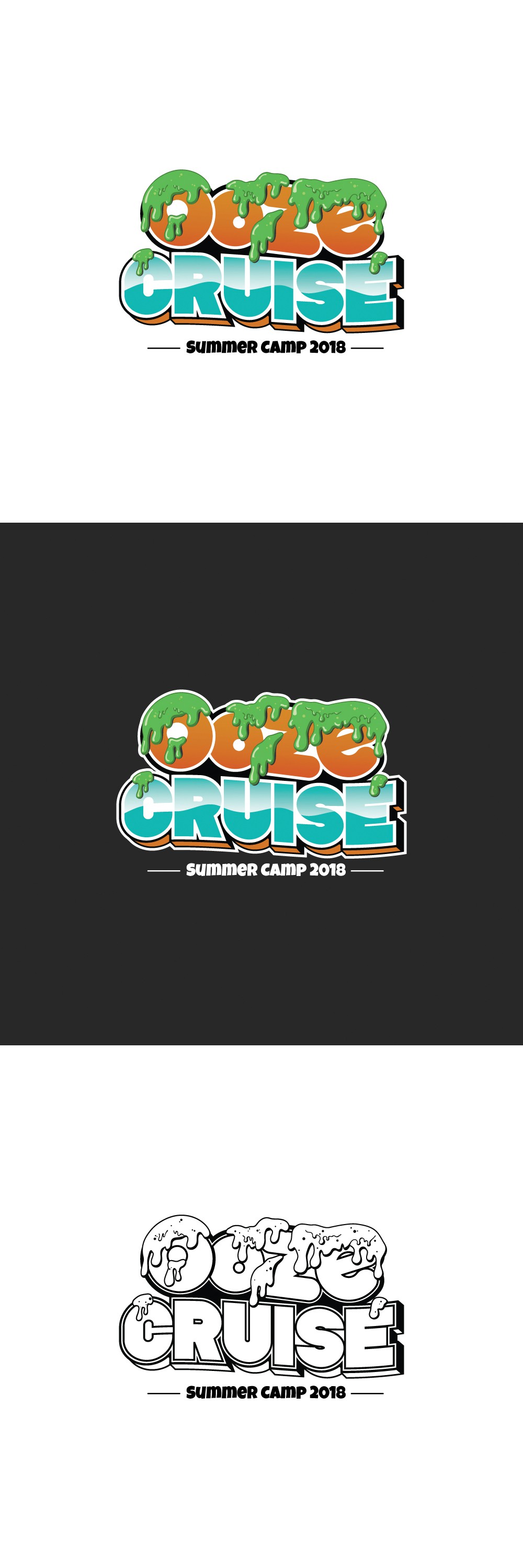
The inspiration behind this logo comes from a previous summer where the theme was first introduced. This is a fresh approach in which I created the text from the ground up and gave it a light-hearted feel. The slime is indicative of the camp's many activities and I liked the idea of it being spattered on and kind of dripping down the word "Ooze". The word "CRUISE" is colored to give it a vacation and sea faring feel. The 3D drop shapes behind "CRUISE" and the accompanying outlines throughout are to help push the text out from the background.