
Created on 99designs by Vista
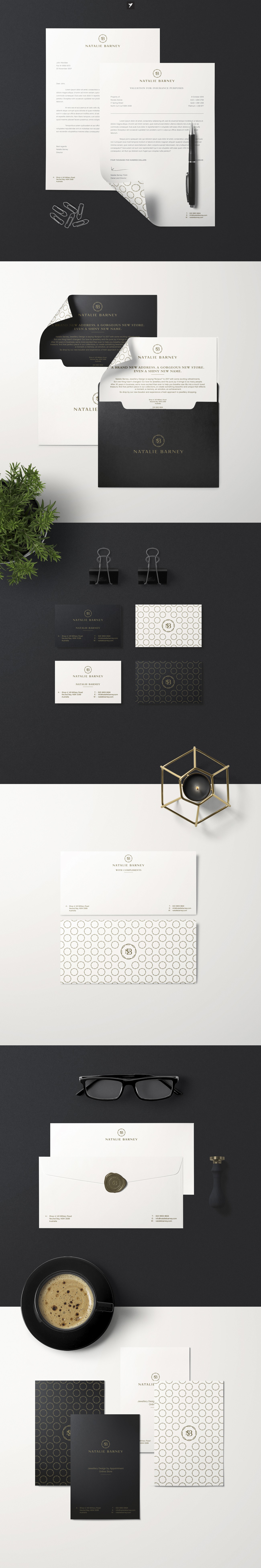
Had great time working on this stationary package for Natalie Barney for which we redesigned logo earlier this year. Main request was to utilize black and white with addition of primary gold color, keeping premium look with utilizing aesthetically pleasing pattern across stationary elements. We both ended super satisfied with how it turned out as it was major update of identity top to bottom.