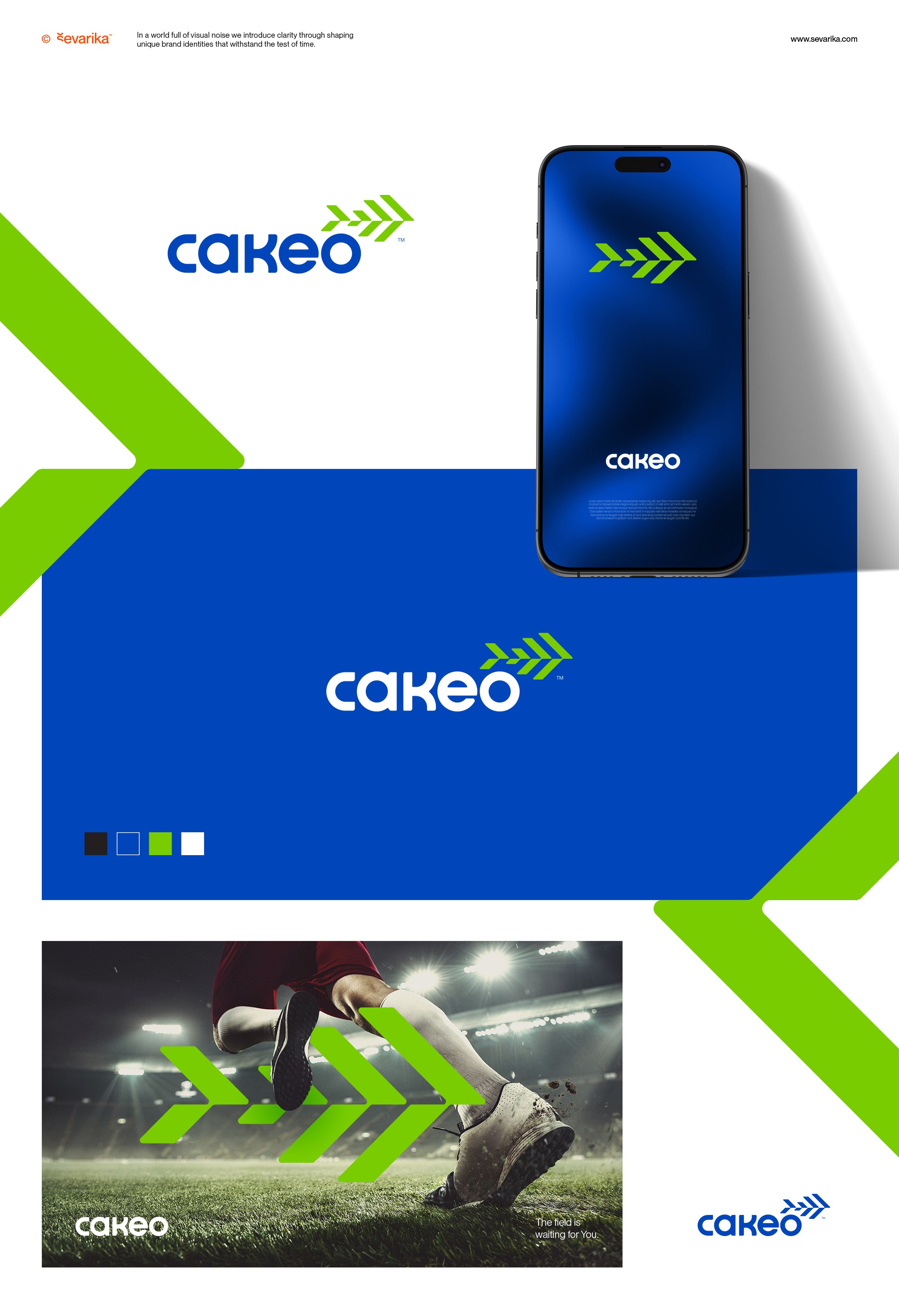

Recently wrapped up logo and brand guide for Cakeo, sport field management platform in Vietnam. The design captures both the energy of sports and the unique charm of the brand’s name "Cá Kèo" which in Vietnamese is the name of a local fish. I designed the custom wordmark that features clean geometric shapes and circular forms, creating a modern, approachable look. The abstract fish symbol is made of angled rectangles that mimic fields seen in perspective—perfectly representing Cakeo’s focus on field management reinforcing its brand identity and providing great brandmark that offer plenty of branding possibilities. These shapes come together at the center to form forward-moving arrows, symbolizing the fast, streamlined experience Cakeo brings to booking and managing sports fields. Design utilzie bold mix of vibrant blues and greens, the color palette that adds a sporty, lively vibe connecting with active users looking for a smooth, dynamic experience.