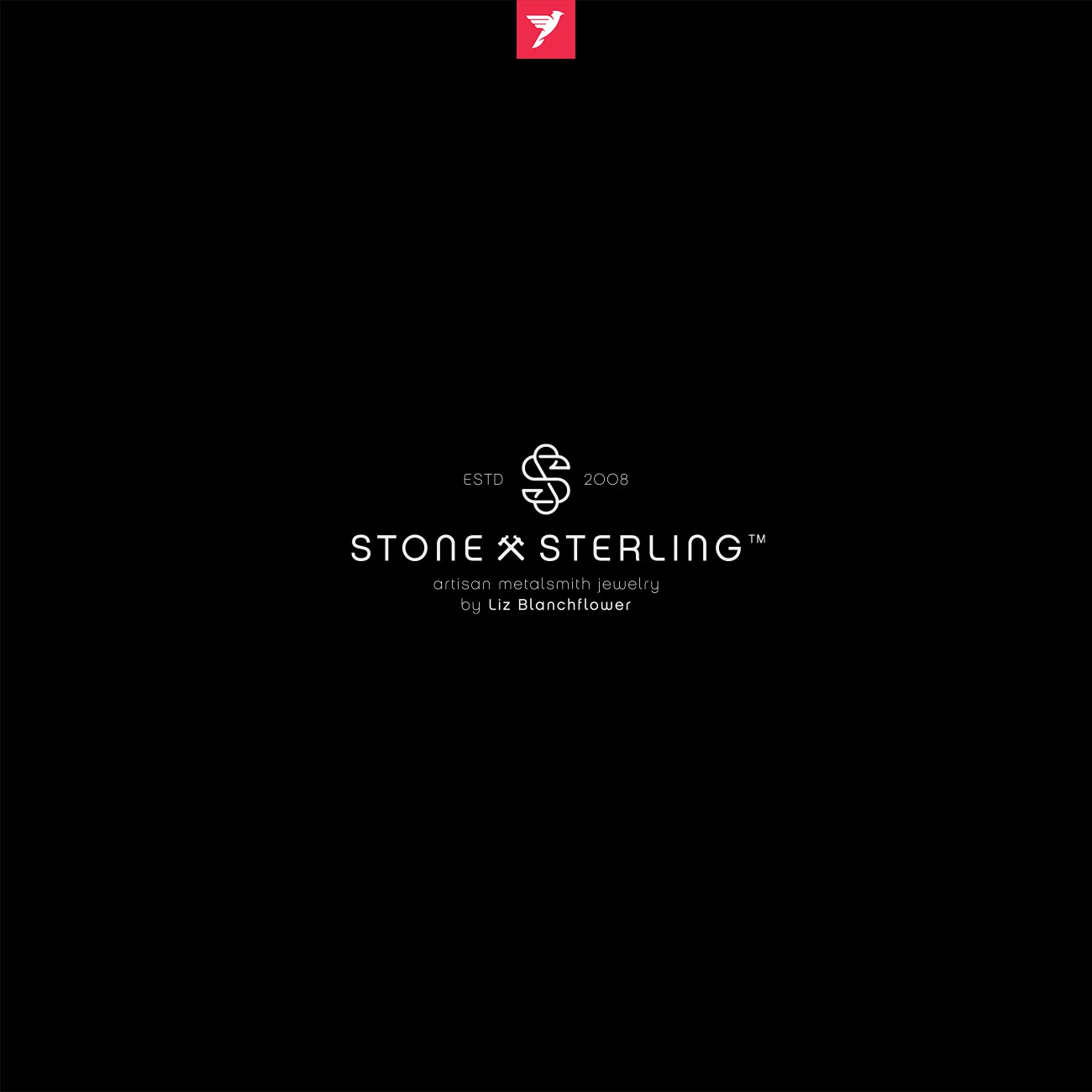

Liz and Rob came to me with another project that they needed completed. They wanted to brand their jewelry business with classy and timeless logo that is both elegant but also crafty. One of main tasks is to include small ball pen jeweler hammer which we did in one way that could work in this design. We brought concept of timelessness and uniformity by using single looping line creating this symbol. It provides enough playfulness while still keeping it classy and stylish.
In addition to it matching typography has been made. I used two fonts from and combining letters from those two I have managed to make it less masculine without using ornaments or script type of letters that may give slightly different message and feel we are trying to convey. It has nice balance of curved letters, which perfectly match roundness and fluidity of symbol, whit classy luxury sans serif characters, with just a little tracking of letters that reinforces elegance.