
Created on 99designs by Vista
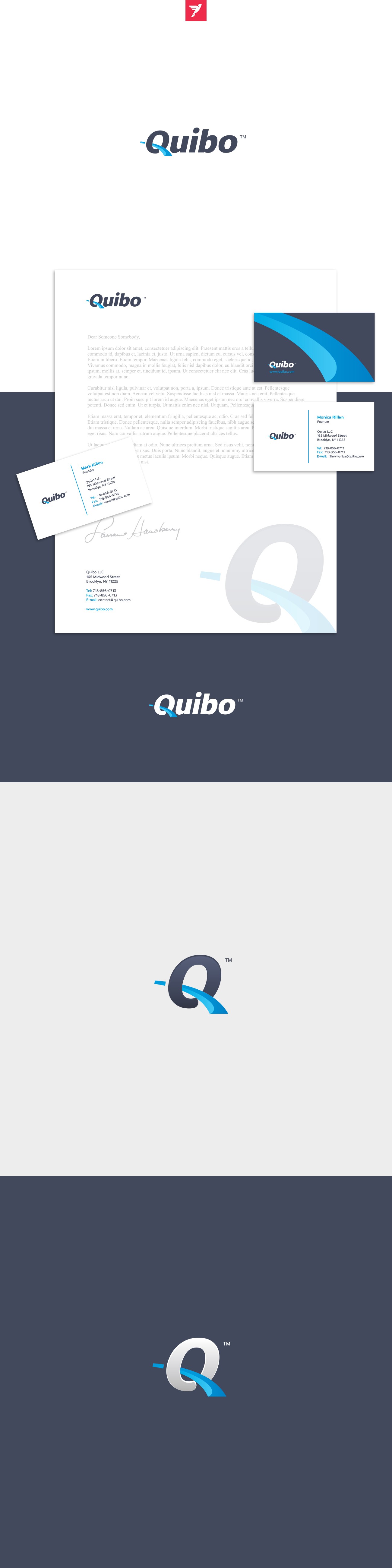
Been working with my regular client on this logo for Quibo. We wanted to keep it simple without any complex symbols just small touches over typography and feature integrated within that could easily be extracted into separate symbol if needed.