
Created on 99designs by Vista
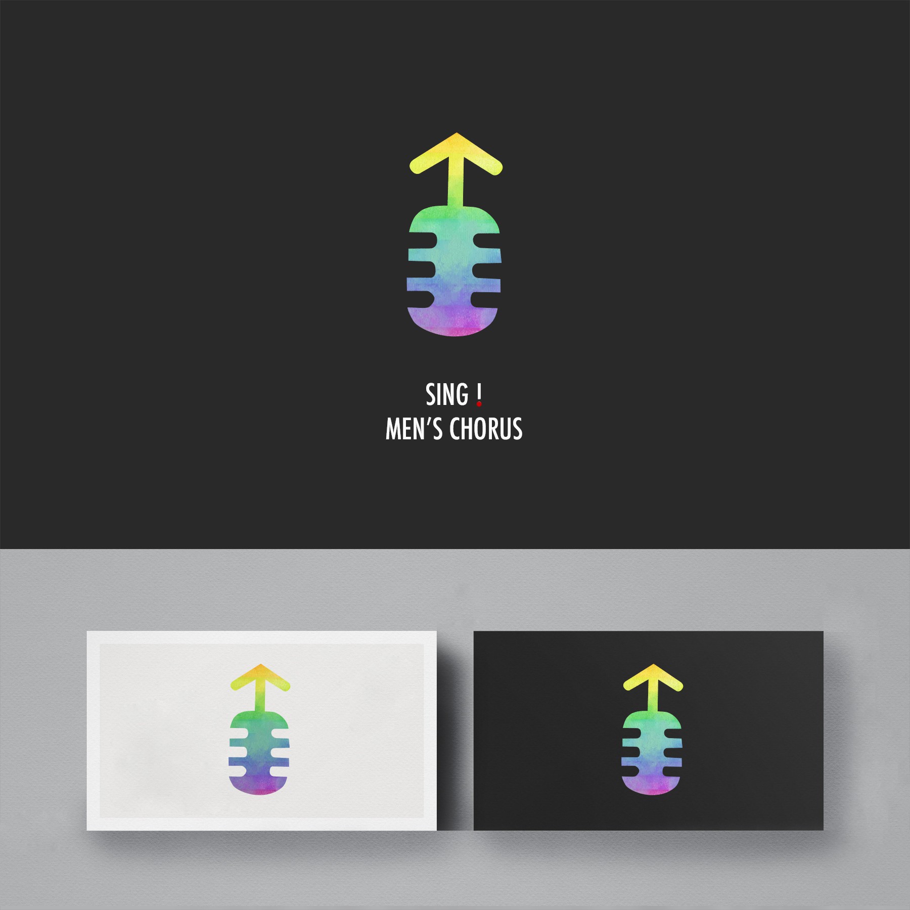
The main centre icon represents singing combined with man logo. The colours represent the different kinds of followers that the choir has (the choir had 70% majority of gay followers, so the client wanted a colourful logo). The SING lettering has a red dot representing Singapore.