
Created on 99designs by Vista
Have been working in an interesting project from my nicest Client.
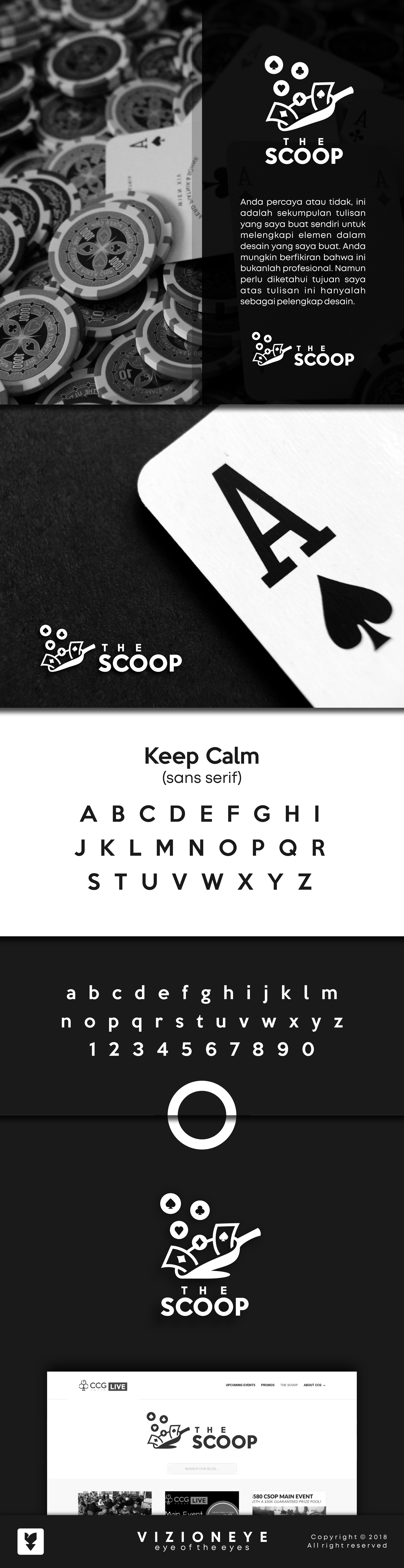
The Scoop itself is a blog of Poker term. The client wanted the logo to be adapted from an ice scoop and signs of poker. It was hard to find some references. However finally we dealt with this concept as the winner. :)
Would like to work with you again!