Logo for Entertainment Center

42
Created on 99designs by Vista
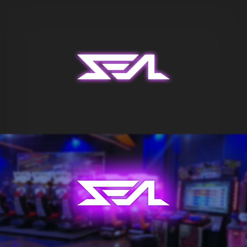
I started off by thinking exactly what type of place the store looked like. There'll be lots of simulation games, bowling, pool table, game cards, and so on. Then I imagined what kind of mood the place would have - it's probably darker than a normal store. So to match the ambiance, a deep moody, yet fun/entertaining type logo would be needed. I imagined a back-lit silhouette of shapes would fit the bill exactly, similar to those of private and exclusive clubs.
The design of the logo itself was more in line with the expectations of the client - modern, youthful, geometric, abstract, and playful. So an angular graffiti-like depiction of the name could work. The final step was to try and make it balanced (in a way). The result is as shown.