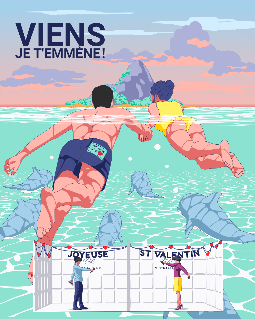
 by lemonGraphy
The illustration took place in a sea. I had to make sure I highlight the beauty of sea features such as its clean water, bubbles, marine life and caustics effects when it hit underwater objects.
I wanted it to be easily enjoyable, but with such number of features and objects that I wanted to highlight in this illustration, I had to make some compensations on some areas such as omitting textures, object lines and drop shadows unless its necessary.
To make the visual message of where the couple wanted to go become stronger, I aligned the dolphin in such way as visual cues of an existence of a destination island.
The colour palette that I used were earty colours that you may find in a sea; like cyan, blue, and white. The other colours I added were to give the image some accents to make the entire composition more appealing.
I used realistic shapes and proportions for the close objects and cartoonish style for the distant objects to make them less focal.