
Created on 99designs by Vista
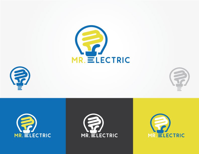
My design process started with a simple name ( Mr. Electric ). I knew I wanted to use a light-bulb to visually show electricity. As I looked at the light bulb, it came to me. Using the M as the inside and the E as the bottom I could tie all of the aspects together making one cohesive design. The end result was a design you could use with or without the company name, could stand alone, and could be used with infinite colors.