Created on 99designs by Vista
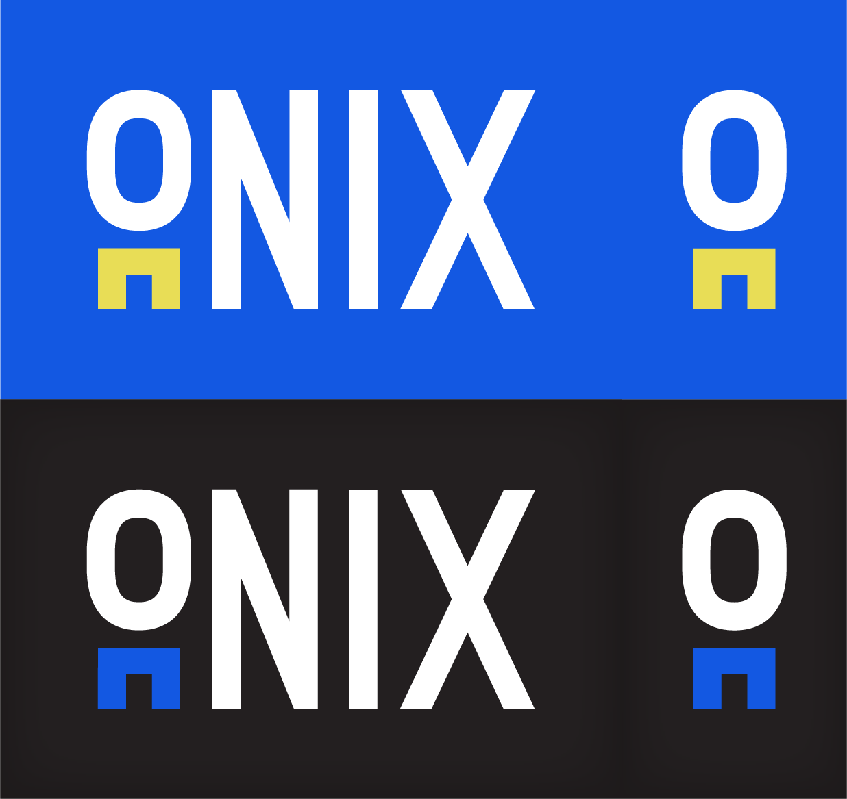
Onix Jeans wanted a minimal logo to reach out to a younger audience. Through many versions I decided to make jeans out of the letter "I" in Onix to suggest what the company is about. I gave two options, one with a more vibrant and eye-catching color palette and another with a more subtle color palette. In this version I left out the word "jeans" because I thought it looked better without it, and the company also makes shirts and other accessories so it would make more sense w/o "jeans" in the logo.
