
Created on 99designs by Vista
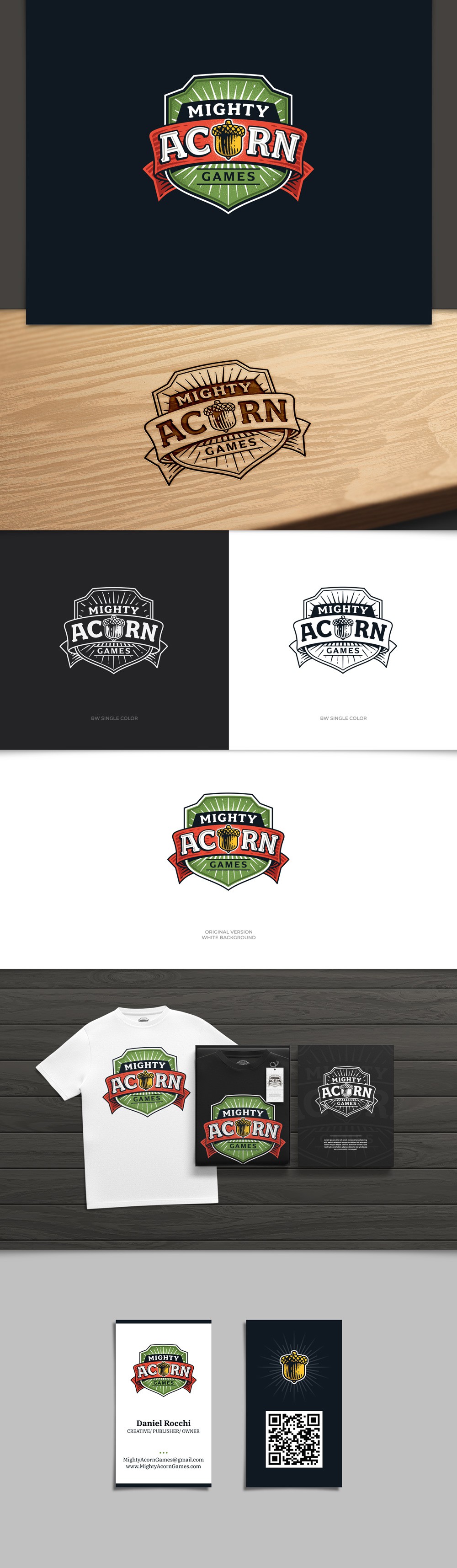
This logo was created to represent a board game publishing company. Most of the board games are for families to play, so the main shape of this logo is simple with subtle details in it.
The design style is classic linocut combined with bright colors to make it look playful. The letter "O" is an illustration of an acorn, which is the center of attention in this logo.